Welcome to Gaia! ::

Reply The Anime Art Academy
a sad person drawing Goto Page: 1 2 [>] [»|]

Quick Reply

Enter both words below, separated by a space:

Can't read the text? Click here

Submit

EdgeMasterChaos

PostPosted: Tue Nov 22, 2005 12:41 am


well i have scrambled through my comp for any scanned pics of mine that had no reference invovled......i found only one..........comment/critique......whatever, but try not to be too harsh on your crits cuz i may take it wrong and it'll end up in a massive flame war and blah blah blah.....and yeah.....lol.......well.........lemme know what you think......

materials: sketch pad, 0.5 mech pencil, q-tip


User Image
PostPosted: Mon Nov 28, 2005 10:38 pm


the other eye is missing and the ear is a bit too high. good try though. one thing to take note is the skull. It looks a bit flat

pkumo


EdgeMasterChaos

PostPosted: Thu Dec 01, 2005 12:28 am


pkumo
the other eye is missing and the ear is a bit too high. good try though. one thing to take note is the skull. It looks a bit flat
i left the other eye out because of laziness....ur right about the ear now that i look at it.....and once again ur right about the skull......but when ya say "nice try though" it makes it seem like i did a crappy job......
PostPosted: Thu Dec 01, 2005 1:33 am


ChaosSoldier320
pkumo
the other eye is missing and the ear is a bit too high. good try though. one thing to take note is the skull. It looks a bit flat
i left the other eye out because of laziness....ur right about the ear now that i look at it.....and once again ur right about the skull......but when ya say "nice try though" it makes it seem like i did a crappy job......


well, I commented 'good try', because that's what I felt. I can't say, 'great, you did an excellent job' when it isn't. As you mentioned, you didn't do your best on the picture by leaving things out... so what do you expect people to say when an art wasn't a 'I've done my best' art.
If you cannot accept criticism, then pls do not post it up. I could have just left it on the second page lost among all the posts but I thought everybody should be given some suggestions since this is the purpose of the guild. So I gave mine.
and you know why nobody commented? it's because of this:
"whatever, but try not to be too harsh on your crits cuz i may take it wrong and it'll end up in a massive flame war and blah blah blah....."...
I should have known better..and took that as a warning.

pkumo


pink sexy

PostPosted: Thu Dec 01, 2005 10:42 am


Yes, I say it looks decent. The eye is a bit too high though and can be a little bigger, and is he a cyclops? He has one eye!
PostPosted: Thu Dec 01, 2005 11:33 am


Its pretty good actually, besides what others have said I noticed his hair... it looks like if he looked up he would be bald cus the hair is pushed so far back... Am I making any sense? I hope soo... crying

cart22


K33n

PostPosted: Thu Dec 01, 2005 12:19 pm


Perfect sense.

About your shading....Don't smudge it. It will just makes a mess of things and make it look unprofessional. If you want to create a smooth texture, use crosshatching then use an eraser to slowly dull it until it looks clean. A persons skin is not completely one color, its a mix of quite a few actually. But everything else has been said, so keep drawing, and you'll get better!

Keene
PostPosted: Mon Dec 05, 2005 1:36 pm


It's pretty good. You may need to study some anatomy. The eye looks a little funky to me. sweatdrop It should look something like this... It's not perfect, but hopefully it will give you an idea. 3nodding

User Image

RedLinks


Tsoonami1607

PostPosted: Mon Dec 05, 2005 1:48 pm


pretty good ( not my usual style so I can't say much about it sweatdrop ) but what in the world is crosshatching? neutral  
PostPosted: Tue Dec 06, 2005 11:12 pm


he's missing an eye, although this was already pointed out. xp

~Nefex~


EdgeMasterChaos

PostPosted: Wed Dec 07, 2005 1:09 am


thanks for the tips....although that pic was from a while ago........haha....
PostPosted: Tue Dec 13, 2005 12:23 pm


Hello there! I like your picture... I think that the smudging looks good... I like that technique... just be sure to erase any unwanted smudge marks to keep the picture clean ^_^!

I decided to make a quick guide... giving some helpful tips... and showing a step by step (sort of) thing... because I have trouble trying to explain it in words.

INTRO:
User Image

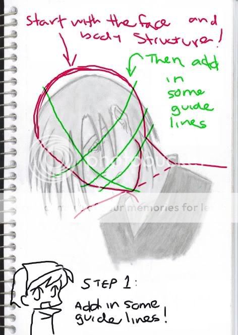
Step 1: Add in guide lines. Be sure to draw in the face and body structure... this well help you to align parts.
User Image

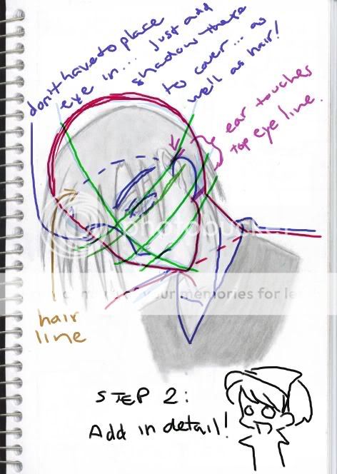
Step 2: Add in detail. Be sure to keep the guide lines as well as the structure lines... this will help to place objects in correct proximity (the spacing between the objects can be better viewed when the guide lines are there). Also... it allows you to see if things are lined up correctly... such as the ear.
User Image

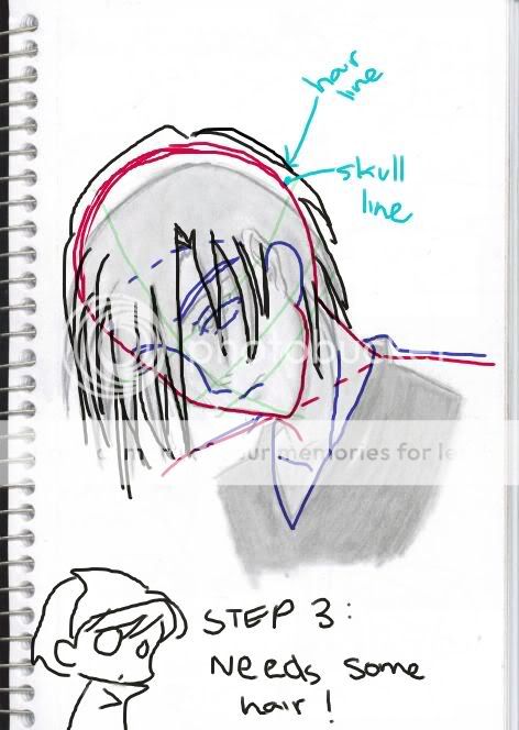
Step 3: Add in hair... unless you want your character bald... hehe... then ignore this step. In the last step (step 2... I added in a hair line... that just gives you a placement for the hair... that way the character doesn't end up having too short of a hair line or too long. BUT hair lines vary... just like they do on real people... so that is up to you to decide where the hair line is placed! Also... between the Hair line and Skull line is a space... This space varies for different types of hair... Again... this is up the the artist to decide how much space they want 3nodding .
User Image

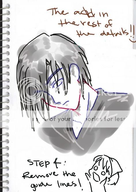
Step 4: Remove the guide lines! Now you can add in the rest of the detail... such as shading. You had one eye missing in the other picture... but you CAN do that... just be sure to shade that area a bit darker... and place a bit more hair infront... that way it looks like it has been covered up. Also... vary tones of shading... You did an really good job of this on the picture... Add in some highlights to the hair... and clothing... it will bring out the shading even more. Also... be sure to add in his eye... 'cause I forgot to... lol xd ! Sorry about the messy shading... I was rushing to get this done xp ! But it still shows the overall picture.
User Image

Step 5: Double Check the picture... Take time to look it over... and see if there are any other mistakes... or corrections that need to be done to the final picture.
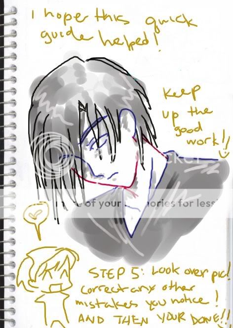
User Image

TA DA... And there you have it! Well, I hope that this was of some help... again... sorry about the messy shading as well as horrible lines... using the mouse to draw is a pain sometimes... lol sweatdrop xd !

So keep up the good work ChaosSoldier320... you have got good skills and I like your style of drawing! Don't worry too much... those are very minor errors... like the ear placement... the overall picture still looks good. We are just trying to help you out... seeing as you posted asking for some!! I cannot wait to see some more of your work... biggrin !


[sorry for the long post... sweatdrop ] ninja

neo_italy


JackalAndromeda

PostPosted: Tue Dec 13, 2005 3:55 pm


neo_italy
(Totally Awesomeness goes here)


That was really fantastic Neo_Italy! It's really nice of you to take the time to explain it so in depth.
PostPosted: Tue Dec 13, 2005 4:28 pm


That's one of the best quick-fix tutorials i've ever seen!

AbstractAngel


Seority

PostPosted: Tue Dec 13, 2005 8:52 pm


AbstractAngel
That's one of the best quick-fix tutorials i've ever seen!

really now?
*is stunned to*
Reply
The Anime Art Academy

Goto Page: 1 2 [>] [»|]
 
Manage Your Items
Other Stuff
Get GCash
Offers
Get Items
More Items
Where Everyone Hangs Out
Other Community Areas
Virtual Spaces
Fun Stuff
Gaia's Games
Mini-Games
Play with GCash
Play with Platinum