|
|
|
|
|
|
|
|
|
 Posted: Wed Mar 08, 2006 2:28 pm Posted: Wed Mar 08, 2006 2:28 pm
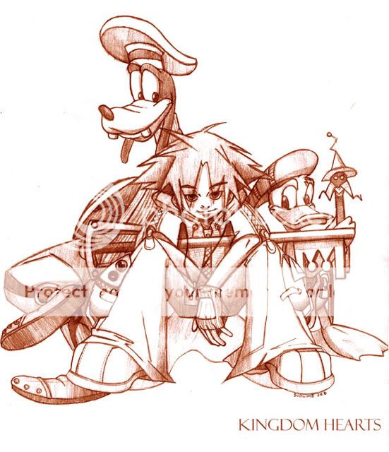
my latest piece Done with an H pencil Done in 5 hours (but who's counting) Done while listening to samurai champloo OST *EDIT*- minor errors fixed, scan cleaned. Color balance and text done in photoshop 
|
 |
 |
|
|
|
|
|
|
|
|
|
|
|
|
 Posted: Wed Mar 08, 2006 2:29 pm Posted: Wed Mar 08, 2006 2:29 pm
|
|
|
|
|
|
|
|
|
|
|
|
|
 Posted: Thu Mar 09, 2006 11:42 am Posted: Thu Mar 09, 2006 11:42 am
|
|
|
|
|
|
|
|
|
|
 Posted: Thu Mar 09, 2006 1:30 pm Posted: Thu Mar 09, 2006 1:30 pm
Pretty cool; reminds me of an official Kingdom Hearts drawing I've seen floating around.
There are a few very big problems with it though. The most glaring flaw is the fact that Sora and Goofy are not on the same plane; though it's all off the easiest way to see this is to look at Goofy's feet. When drawing on a white plain, you have to be careful you keep in mind where the ground is, otherwise people break through the floor and that separates them from the drawing.
Donald is on the same plain as Sora, however, Sora is stepping on his feet. Also, the spot where the Key-blade is spacially wrong; it should be behind Donald.
I like the reddish tone you applied; and the hard cell shaded nature of the sketch lends itself well to the subject. Good job.
|
 |
 |
|
|
|
|
|
|
|
|
|
|
|
|
|
|
|
 Posted: Thu Mar 09, 2006 5:39 pm Posted: Thu Mar 09, 2006 5:39 pm
niceeeee! but..o.o....sora's area near the butt seems kidna flatt and wow he looks ebilll! @_@...love ur drawing =]] whee
|
 |
 |
|
|
|
|
|
|
|
|
|
|
|
|
 Posted: Fri Mar 10, 2006 7:11 pm Posted: Fri Mar 10, 2006 7:11 pm
YaY for the Champloo inlfluence! It obviously works well with you ^_^ |/..
Did you happen to smell the scent of sunflowers?
|
 |
 |
|
|
|
|
|
|
|
|
|
|
|
|
|
|
|
 Posted: Fri Mar 10, 2006 8:02 pm Posted: Fri Mar 10, 2006 8:02 pm
Nice pic! ^^ It looks really cool and Sora looks evil. But that's what makes it good anyway. I like it. ^^
|
 |
 |
|
|
|
|
|
|
|
|
|
|
|
|
 Posted: Sat Mar 11, 2006 12:24 pm Posted: Sat Mar 11, 2006 12:24 pm
Syrisala YaY for the Champloo inlfluence! It obviously works well with you ^_^ |/.. Did you happen to smell the scent of sunflowers? heh heh, thanx. Ironically, sunflowers don't have a smell.
|
 |
 |
|
|
|
|
|
|
|
|
|
|
|
|
|
|
|
 Posted: Sat Mar 11, 2006 12:35 pm Posted: Sat Mar 11, 2006 12:35 pm
yayy kingdom hearts fanart! whoot!
i love the clean feel to this picture and the color you chose for it.
woa sora turned evil?? o_o;; lols.
um it looks like sora is stepping on goofie's foot
i like donald's star-wand-thingy. so cute 3nodding
|
 |
 |
|
|
|
|
|
|
|
|
|
|
|
|
 Posted: Tue Mar 14, 2006 1:42 am Posted: Tue Mar 14, 2006 1:42 am
o.O wow! that's an awesome picture. you can barely make out the rock sora's sitting on - but thats probably it ^.^
|
 |
 |
|
|
|
|
|
|
|
|
|
|
|
|
|
|
|
 Posted: Tue Mar 14, 2006 1:57 pm Posted: Tue Mar 14, 2006 1:57 pm
OMG!!! I LOVE KNGDOM HEART AND THAT IS A REALLY good picture!!!
|
 |
 |
|
|
|
|
|
|
|
|
|
|
|
|
 Posted: Tue Mar 14, 2006 4:23 pm Posted: Tue Mar 14, 2006 4:23 pm
Hmm Mairi, I'm going to have to dissagree about one thing.
That Keyblade looks like it's in the right place....
But anyway, other that that one thing. Donalds staff is flat, and flat= Bad. Shade it like you did the shaft on the keyblade, and it will be the smex along with the rest of the picture!
Keene
Byyyy the waayyyy. I'm ACTUALLY looking forward kingdom hearts 2....
I heart Mulan. *shrug*
|
 |
 |
|
|
|
|
|
|
|
|
|
|
|
|
|
|
|
 Posted: Sun Mar 19, 2006 8:07 pm Posted: Sun Mar 19, 2006 8:07 pm
I've seen crappy fanart before... but this I do like.
|
 |
 |
|
|
|
|
|
|
|
|
|
|
|
|
 Posted: Tue Mar 21, 2006 6:50 am Posted: Tue Mar 21, 2006 6:50 am
Meep! Sora looks AWSOME!! And....... SEXEH!!!!! I CANT WAIT FOR KH2!!! KH IS MAH FAVORITE GAME!!!!!
|
 |
 |
|
|
|
|
|
|
|
|
|
 |
|
|
|
|
|
|

