|
|
|
|
|
|
|
|
|
 Posted: Fri Aug 20, 2004 9:59 pm Posted: Fri Aug 20, 2004 9:59 pm
|
|
|
|
|
|
|
|
|
|
|
Posted: Sat Aug 21, 2004 9:45 am
|
|
|
|
|
|
|
|
|
|
|
|
|
Posted: Sat Aug 21, 2004 12:18 pm
|
|
|
|
|
|
|
|
|
|
|
Posted: Sat Aug 21, 2004 4:30 pm
|
|
|
|
|
|
|
|
|
|
|
|
|
Posted: Sat Aug 21, 2004 5:21 pm
|
|
|
|
|
|
|
|
|
|
|
Posted: Sat Aug 21, 2004 5:32 pm
|
|
|
|
|
|
|
|
|
|
|
|
|
Posted: Sat Aug 21, 2004 9:21 pm
|
|
|
|
|
|
|
|
|
|
|
Posted: Sun Aug 22, 2004 11:27 pm
 |
|
|
|
woot, go graphic design major go smile i love explaining what i learn in school, it makes me feel so smart. also, it's a good signifier that i've learned something.
Kitsunehime I think of 'Graphic Design' as anything that incorporates text, images, and the like to get a message across.
she pretty much hit the nail right on the head there. whenever an individual or a company publishes something that is going to be destributed to large audiences, the vast majority of media they'll be dealing with contains visual elements. "Graphic Design" is a message being communicated visually. Whether it's an ad in a magazine, a website, or a commercial on tv, someone needed to design what you're seeing so that it effectively communicates the message the person/company is trying to get across to his/her/their audience in a way that is both memorable and visually appealing.
as an example here's something i did for my Graphic Design 2 class. the assignment was to make an ad for a fruit with a USP (unique selling point) and target audience. my group used pomegranates, our USP was that they fight heart disease and my target audience was teenage male comic book nerds... though most heterosexual males would find it appealig.
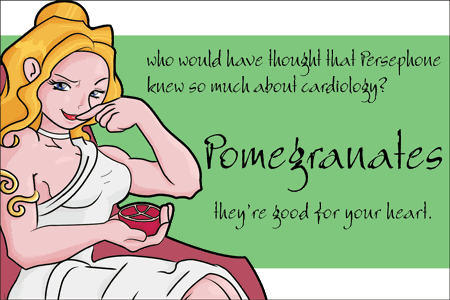
that is copyright Brian Grossman by the way. anyway, all the visual elements in the ad were deliberately chosen. the girl is Persephone, Greek goddess of the Spring (i'm to tired to explain the mythology involved with her and pomegranates, however their relationship isn't pivotal to the ad since she's a pretty girl with a low-cut toga), and you'll note how the line weight in the illustration varies. This keeps your eye moving around the picture and appreciating that she's a pretty girl with a low-cut toga. All the colors i chose were warm, so the stripe is an olive green because a)it's the complementary color of the red-violet pomegranate, b)it's a muted shade that won't distract the viewer from the other visual elements but cools down the image a little without throwing a huge amount of a cool color in there (which would be way to abrasive), and c)olives were a big part of the Ancient Greek diet and since i'm a huge nerd i found it a suitable choice.
the background has a stripe and isn't completely filled to subconciously direct the viewer toward the text once they're done oggling the pretty girl with a low-cut toga. the typography was even deliberately chosen. it's colored black because of the pronounce black lines in the illustration and the scribbly lookin' font was chosen because it balances the attention between it and the image (as a plain font would be ignored, a script would have also worked well but i couldn't find one that would arrange the way i wanted without looking like dung).
in anycase, Graphic Design is putting together visual elements (even the small subconcious ones) to deliver a message. i hope that helped... if not, i got an excuse to show off my girl with a low-cut toga (and rampant anatomical problems, i know, but she's a cartoon).
|
 |
|
|
|
|
 |
|
|
|
|
|
|
|
|
|
|
|
|
|
|
|
|
Posted: Sat Aug 28, 2004 5:28 pm
|
|
|
|
|
|
|
|
|
|
|
|
|