-----------------------------------------------------------------------------------
NEWEST ARTWORK IS FARTHER DOWN
If you'd like to see more: My Deviant Page
This is a thread which I will devote to all my art work versus making a new one and cluttering the forum. I'm in my first year of art college and do most of my final pieces in either Adobe Photoshop or Macromedia Flash, others being Adobe Illustrator, 3D Max, and possibly later Maya. I always use a Wacom Tablet with almost every piece (excluding vector and true 3D).
If things look good and I'm offered enough gil, I may start doing requests/avi art. 1500g perhaps? I guess I'll judge it upon size, difficulty or time frame. So don't get discouraged if you just simply want a background, I'll be fair.
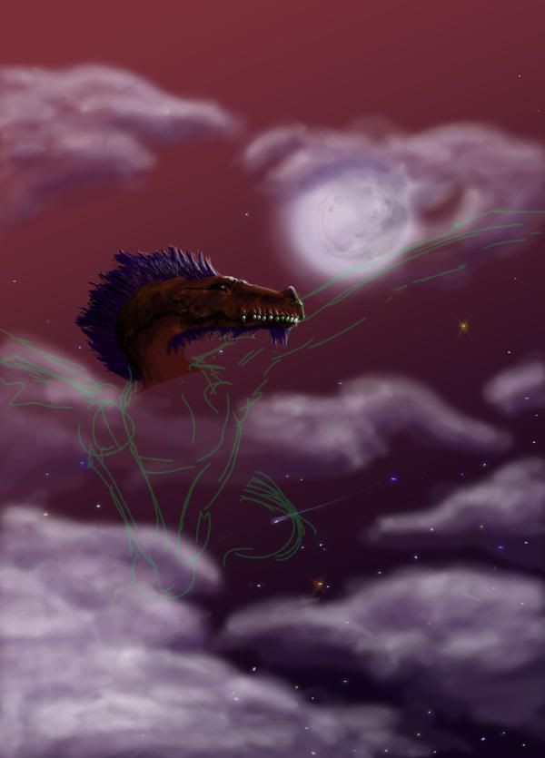
WANDERING DRAGON [submitted] - Join date (still in production)
I just joined the guild so I thought I'd start off by showing a piece still in production. This is 3 hours into a photoshop drawing. It's only my second one ever.
Unfortunately I'm having problems finishing it. I lost the pdf file and all i have is an 8 quality jpeg now. Any suggestions on how to pick it up again???
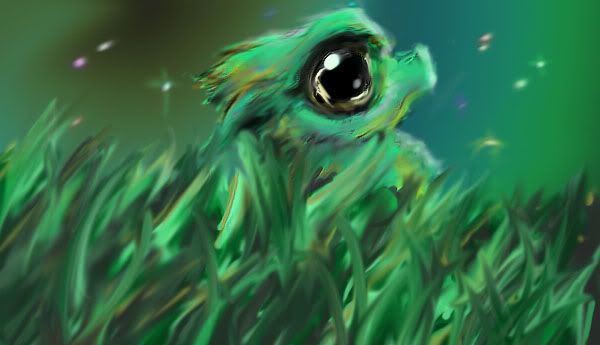
Marsh Whelp [submitted] - 5/03/06 (completed)
Little baby dragon thingy. Not as dedicated as my incompleted dragon I submitted (oh the irony). Only a 2 hour quicky drawing. I'm fully aware that the dragon is hard to see, but that's what I wanted.
Once again all Wacom tablet using Adobe Photoshop. Started with a sketch and traced it with the tablet.
Once again not one of my very serious effort intensive pieces, but I still like it, the colors are really fun. Though I may make a more dedicated attempt later (it will look enitirely different if so).
I'm tempted to put tutorials on all my artworks so I guess I'll start here.
How it's done
1. First I made a VERY rough sketch of the main object/character on standard 8x11 paper and scanned it in. Basically just get the expression, body expressions, gravity, and basic linear lines.
2. Throw it in to Adobe Photoshop. For all you up and coming artists Photoshop is a MUST for all digital artist. If your only into traditional styles then Corel Painter can be a substitute (Corel can immitate actual media VERY nicely).
3. Make it your first layer in Photoshop.
Layers are your best friend. My drawing is only about 15. layers enable you to edit certain parts and leave others alone. I diveded my layers like this:
Group "EXAMPLE: head"
> Highlight
> Shadow
> White
> Black
> Rough
> Secondary color
> Main color
4. I first start with the the Rough Layer. Basically you zoom in and trace your scanned in drawing. Generally I trace in a bright obscure color so I can see it better. To do this I use a tablet. While some people are very uncomfortable with these, I feel it is a must once again for digital artists. This will ensure accuracy and time. Also it gives you the benefit of angle and pressure. Meaning you can set the thing to be responisive to your angle and how hard you press down, just like a real pen.
5. Now we go to Main Color Layer. Here we pick one color and just coat fill in the lines we made in rough layer. It should be just a shadow of your drawing.
6. Next move Secondary Color Layer. Here Is basically where I choose darker versions of the same color or add in stripes etc...simple. Obviously more layers can be added for more colors and textures.
7. Black and White Layers are dedicated solely to things that will be either 100% black or white.
8. Now we move to the Shadow Layer. When doing shadows I begin to use my favorite effects of layering; opacity. Opacity basically makes your stuff translucent. Also you can change both your brush and your eraser to paint with opacity settings. For shadows I set my brush to 10% and choose black. Now I just make multiple strokes and I can gradually blend in 10% incriments. Overlapping your strokes will stack the effect. 10% will become 20%, 20 % becomes 30%, etc...
9. Highlight Layer. Same thing as shadows. Be very careful as to many highlights will look messy whereas you can abuse contrast all you want. I use a very small brush when doing highlights.
My basic technique here is using an opacity brush. I did not sit there and pick all these wonderful colors. I basically blended two together by making one 100% and another 40% or something. The stars were made in two layers. 1 was simple white dots, the next was a 20%-40% opacity brush that I either crisscrossed on or made a glowy circle on.
Contrast and highlights are more important then the actual linear lines in my eyes. I've seen some shitty drawings look amazing once these get laid in. While it takes skill to recognize where some may go (I'm still learning) be very aware of these and never leave them out. A simple rule for beginners: contrast can be heavy or light, preferably heavy and use highlights sparingly.
10. Background/Foreground - do a different stratgey of layering.
Group "Background"
> Main light Source
> Highlights
> Shadows
> Foreground
> Sky double
> Glows
> Distant Objects (stars/moon/etc...)
> Background
> Sky
Start with sky. Make a basic gradiant and angle it the way you want.
Next draw in your background and distant objects.
Now using your opacity brush make your glows, highlights, and shadows.
Now duplicate your sky gradiant and layer it inbetween foreground and glows. Drop the layer opacity to really low.
Finally use your gradiant tool again and switch it to radial. Make it White to Black (you can also use light to dark colors) and tone down their opacity. Then click and drag to put the hot spot where you want it and gauge the fade to darkeness.
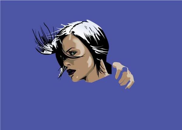
Aeon Flux Edit [submitted] - 5/08/06 (still in production)
Got eager so I thought I'd show early. This is an Adobe Illustrator drawing.
Adobe Illustrator is Adobe Photoshops close cousin. Rather than working in rastal (sp?) imaging (pixels), it deals with vectors (everything is nothing more than a mathmatical formula allowing you to change size and distort without losing any quality). It's a bit harder than Photoshop but once you get past hating it you can do a lot of cool things that Photoshop couldn't dream of doing. Since eveything is nothing but lines and fills it's a bit harder to draw and you work more in the style of "cell" shading versus blends (though they can be done).
This is a trace. Now just because it's a trace by no means is it easy at all. The single eye alone is comprised of 7 layers...currently in this unfinished piece is about 40. Knowing what shading to keep and what to throw away is really really hard. I did to a few altercations, the biggest being lip color. The final product will show her fully down to the bottom of the breast. Only 5-6 hours put in it so far. NO AUTOTRACE OR SHORTCUT METHODS WERE USED.
Life Breathes Death [submitted] - 8/05/06 (finished)
Been gone for awhile. Thought I'd run a different direction this time. This was part of an assignment where I just had to do anything abstract based on something i saw in a room, which happened to be a skull. So a week later it's due and I realize I have 40 minutes to produce a piece of abstract art. Rushing to Corel Painter 9 and going through the many emotions of anger and delight as I use this strange digital art program, I finally produce this. Naturally the class was a bit taken aback as I forgot that the homework was only expected in grey scale pencils...oops...oh well.
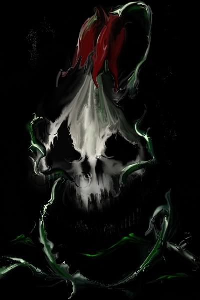
How did i do it in such a small amount of time? Well I didn't draw it out like that for one. Basically I did a very rough sketch of the skull and colored and shaded it a little. I then used a vast variety of smearing and distorting brushes to form it in the way i wanted. The vines and flower were created by throwing 4 colors I liked onto the canvas and once again using distortion burshes to push and shape the paint in the way I wanted (they were litterally blobs of incoherency before the distortion).
So interesting program with a few flaws. If I ever go further in this I'm going to go in photoshop and rip the vine/flower/skull off the black background and seperated so I can use Corels impasto effects (they effect all layers) and the later add the vine/flower/skull back on top unaffected. So only 40 minutes of art for now...
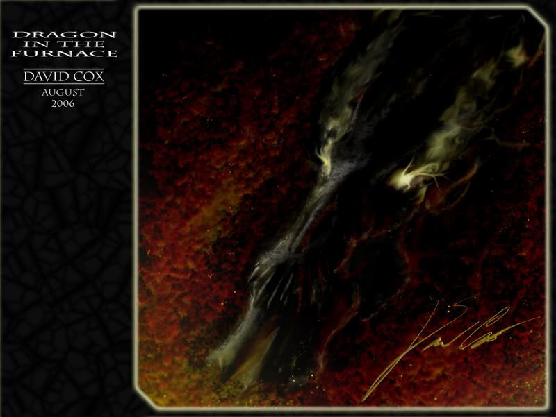
Bone Dragon in the Furnace [submitted] - 8/9/06
Quicky doodle of a bone dragon I've been concepting over the week. Decided to flesh him out an hour in photoshop just to see where it was going. Debating if I like the glow effects on the eyes.
Photoshop with a lot of few layer effects. Used textures on a lot of the things to give it more realistic feel. The fire was made with a double layered (one under the skull one over) scatter brushes. Basically I just made the scatter create ovals and then I went in and blurred them, smeared them and even beveled them a little.
Obviously smears created the smoke, fire, glow effects.
I then doubled the picture and made the top layer a color burn with 8% fill
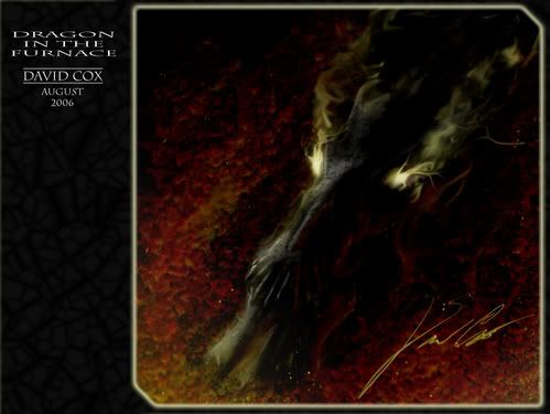
And for desktop purposes right click/save as background and choose stretch and this should be perfect size:
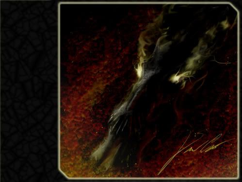
UPDATED DRAGON (10/13/06) - yeah finally made it more accurate and a slight bit more clear. Enjoy.
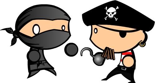
Ninja Vs. Pirate [submitted] - 8/26/06
Characters for my Flash animation Ninja vs Pirate. Should be done September 16th, AND it will actually be finished unlike a lot of my "ooo I'm working on such and such...it should be done by yadaya time". So if I don't finish I can feel the warm embrace of an F for the class.
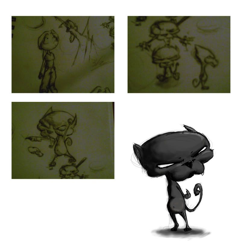
Doom Cat [submitted] - 10/13/06
Character for one of my classes.
Going for the whole Invader Zim attitude. Ya know the whole I think I'm terrifying in my quest to rule out pesky humans but in actuallity I'm really a pathetic spaz? So yeah, Doom Cat is only what the character has dubbed himself. A real name has not been chosen and I ask you who actually see this to offer your suggestions.
What I'm looking for: something cute and degrading to counteract the characters ego. "fluffums" would be an example of what I'm aiming for.
Also fully aware the 3 photographed shots are blurry to all hell...working on a scanned update or possibly a vector drawn redo.
Factory Menu [submitted] - 10/19/06
My final for my flash class. I did everything from the graphix to the music. You'll need Flash Player 8 I think.
Click here to see it


