Welcome to Gaia! ::

Reply The Anime Art Academy
Pic, crit... anyone?

Quick Reply

Enter both words below, separated by a space:

Can't read the text? Click here

Submit

Dark Bunny Lord

PostPosted: Wed Nov 01, 2006 5:16 pm


User Image


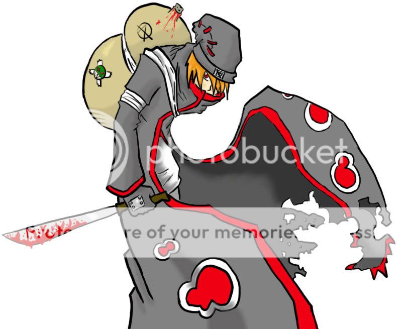
Been doing art for a while now but when I cg'd it all came out rather crappy. Got a tablet and figured out the pressure sensativity, then left photoshop illustrater for normal photoshop CS and am quite pleased with the results.

Anyways heres my first attempt, just thought I'd share it.
The character is an OC in a naruto guild rp called "Naruto the Forbidden Scrolls"
The character has a deep backround as the rp has been going for over a year and his abilities revolve around manipulating blood (thus why the gourd has some spilling out of it.)
User Image
Anyways I'd like to get some thoughts on what you like, what can be improved, etc. Constructive crit basically.
Bieng my first time I know theres bound to be errors so the crit is much appreciated as it will help me know where to focus my attention more next time.

User Image
PostPosted: Sun Nov 05, 2006 11:08 am


My only improvement would be blood dripping from the sword.

Shanexwasxhere


Icellina

PostPosted: Sun Nov 05, 2006 11:52 am


I think adding some dripping blood off the edge of the sword would help a lot! Try to make it as 'fluid looking' as possible--to really accentuate the fact that it is blood, rather than just red goo.


I also think making the shadows darker and more dramatic (especially since the nature of this pictures is darker) would help 'bring out' your character and make his presence a lot more powerful. Right now, I think the character looks okay--but nothing about him screams 'scary' or 'malicious', which I believe (please correct me if I'm wrong) you were going for. Sort of a 'shady character' vibe, right? Right now, he looks too 'nice' to do much damage. Strengthening the shadows and uping the contrast would help so much! It would also add some depth to his form and make him 'pop'.
PostPosted: Sun Nov 05, 2006 11:25 pm


User Image

Icellina
I think adding some dripping blood off the edge of the sword would help a lot! Try to make it as 'fluid looking' as possible--to really accentuate the fact that it is blood, rather than just red goo.


I also think making the shadows darker and more dramatic (especially since the nature of this pictures is darker) would help 'bring out' your character and make his presence a lot more powerful. Right now, I think the character looks okay--but nothing about him screams 'scary' or 'malicious', which I believe (please correct me if I'm wrong) you were going for. Sort of a 'shady character' vibe, right? Right now, he looks too 'nice' to do much damage. Strengthening the shadows and uping the contrast would help so much! It would also add some depth to his form and make him 'pop'.

Ok thanks loads.
The shadows I spent like... 10 minutes on lol.
I mean it's my first time with normal CS and all so I'm not to used to doing loads of shadows and what not on it, I'll be sure spend more time on shading next time though 3nodding

User Image

Dark Bunny Lord

Reply
The Anime Art Academy

 
Manage Your Items
Other Stuff
Get GCash
Offers
Get Items
More Items
Where Everyone Hangs Out
Other Community Areas
Virtual Spaces
Fun Stuff
Gaia's Games
Mini-Games
Play with GCash
Play with Platinum