Welcome to Gaia! ::

Reply The Anime Art Academy
Constructive Crit, Mizu Daisuke

Quick Reply

Enter both words below, separated by a space:

Can't read the text? Click here

Submit

Dark Bunny Lord

PostPosted: Sun Nov 05, 2006 11:40 pm


User Image


Fist just let me note that this was made before the comments on my last drawing where put up, so it to lacks quite a bit of shading.

Anyways, my last drawing (thread here with a guy holding a bloody machette and wearing a large gourd) I posted several places since it was a new way I was doing art, shortly there after I got 3 real money order commissions which took me aback actually since I never thought I'd actually get paid actual money for art.

Anyways, this comission was my first of such. Once more I enjoy constructive crit, however the "lack of shading" is already noted from the comments on my last drawing and I'll be spending alot more time on it in future artwork.

Now onto the piece. Referance descrpriptions where given for the clothing, and hair, other than that the pose was left up to me. It was a naruto OC that used needles as there main weapon, so I figured I'd try to somewhat instill that into the pic.
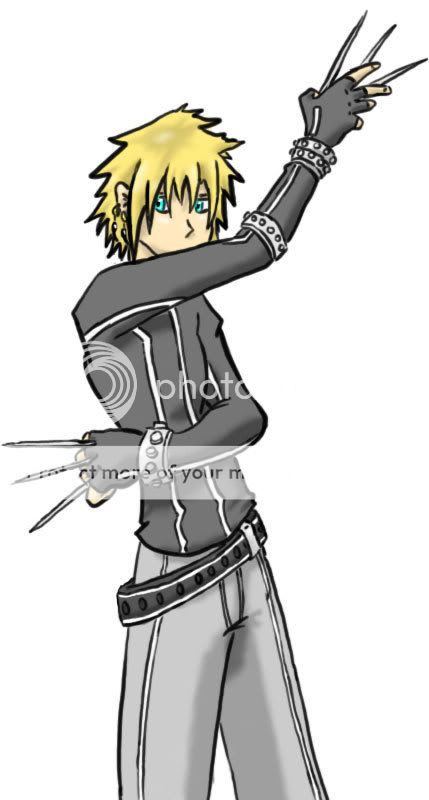
User Image

User Image
PostPosted: Mon Nov 06, 2006 11:14 am


Well, I love the pose--but for some reason it almost lacks energy to me. Maybe in the future you could try leaning the character or...bending his back further to emphasize his movements. The fact that his body is leaning but his head is erect shows me that perhaps he struck a 'dry pose' using only his arms and hands, while keeping the majority of his body stationary.


Maybe trying to make variations in your line quality (as in, some lines are thicker where there is shadow and weight, and some lines are thinner in areas) would help too. Breaking up the line a bit and forcing the eye to create the shape for itself (not saying there should be no lines, but vary them once and a while) will create some added interest in your work. It will add the feeling of 'movement' which I think this picture may lack to a degree.

I do like your work still and your style--and notice you are wonderful at proportions and body placement (everything looks like it should be there, nothing is awkward in arrangement).

Icellina


AkiraBirtron

PostPosted: Mon Nov 06, 2006 1:11 pm


How hard do you want criticism?
Please specify the [F] Rating in the critique guidelines.
PostPosted: Mon Nov 06, 2006 3:51 pm


User Image

Icellina
Well, I love the pose--but for some reason it almost lacks energy to me. Maybe in the future you could try leaning the character or...bending his back further to emphasize his movements. The fact that his body is leaning but his head is erect shows me that perhaps he struck a 'dry pose' using only his arms and hands, while keeping the majority of his body stationary.


Maybe trying to make variations in your line quality (as in, some lines are thicker where there is shadow and weight, and some lines are thinner in areas) would help too. Breaking up the line a bit and forcing the eye to create the shape for itself (not saying there should be no lines, but vary them once and a while) will create some added interest in your work. It will add the feeling of 'movement' which I think this picture may lack to a degree.

I do like your work still and your style--and notice you are wonderful at proportions and body placement (everything looks like it should be there, nothing is awkward in arrangement).

Yeah I get what you mean, I really wanted to do a more action oriented pose with this one, however I also wanted to incorperate the needles, however when I attempted (multiple times) to do so, the hands always came out awkward looking bieng open and throwing the needles or something to that extent.
Anyways, thanks for the crit, it is as always very appreciated.


AkiraBirtron
How hard do you want criticism?
Please specify the [F] Rating in the critique guidelines.


Eh? Well doesn't really matter. I mean I want to know how to improve obviously but one does not need to be rude or harsh to do so. I don't feel like forcing anyone to give a certain level of opinion though.

User Image

Dark Bunny Lord


-Hydrogenated-Bee-

PostPosted: Mon Nov 06, 2006 6:21 pm


I agree with Icellina about no energy, he has needles and he looks harmless. I think it's the eyes, make him look dangerous, like he really means it, none of this nonchalant gazing. Maybe use darker colors or eyeliner?

But otherwise, he's pretty good!! ^^

I hope I helped.
Reply
The Anime Art Academy

 
Manage Your Items
Other Stuff
Get GCash
Offers
Get Items
More Items
Where Everyone Hangs Out
Other Community Areas
Virtual Spaces
Fun Stuff
Gaia's Games
Mini-Games
Play with GCash
Play with Platinum