Welcome to Gaia! ::

Reply The Anime Art Academy
[F3] Critisism Needed!

Quick Reply

Enter both words below, separated by a space:

Can't read the text? Click here

Submit

Risolution

PostPosted: Tue Nov 07, 2006 11:57 am


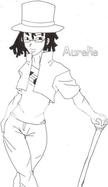
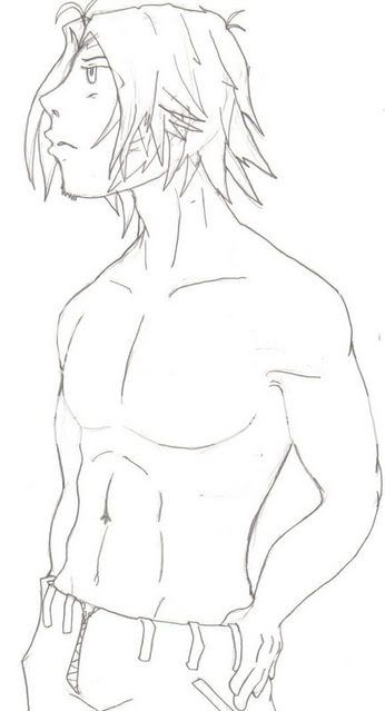
Ok...I feel that it's about time I upped the anty of my quality of work. I have 2 pictures here. I know there's a billion things wrong with them, but I just don't know what. Critisism wanted, Comments appreciated, Re works liked, etc.

Oh...and for the picture with the guy...any ideas on a background?
User Image

User Image

I would put these i link form, but I've had times when I did that and people would say, "where's the pic?"
PostPosted: Tue Nov 07, 2006 2:56 pm


* Both of their arms seem disproportioned and way too short. Keep in mind that a human when their arms are all the way down their finger tips are at about halfway between the hip and the knee.

* The male's eyes are too high on his head, he basically needs a forehead. Elongate the line from the nose up a bit more and that the hair farther up as well.

* The hands are also rather short, keep in mind their proportion is that of more or less the face. If you put the bottom of your palm at your chin your finger tips should end at the end of your forehead.

* The female's upper legs before the knee need to be slightly longer. Unless I am misunderstanding what the pants are doing.

I will add, well done with the hips of the female and the abs of the male! I have trouble with man-abs for some unknown reason.

Now that I'm looking at the abs, the male's belly button should be lower, it makes his stomach look short.

Shizzle Bam Boom-


Risolution

PostPosted: Tue Nov 07, 2006 7:32 pm


Thank you very much! I shall take that to heart!
Reply
The Anime Art Academy

 
Manage Your Items
Other Stuff
Get GCash
Offers
Get Items
More Items
Where Everyone Hangs Out
Other Community Areas
Virtual Spaces
Fun Stuff
Gaia's Games
Mini-Games
Play with GCash
Play with Platinum