|
|
|
|
|
|
|
|
|
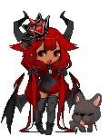
 Posted: Fri Aug 24, 2007 8:56 am Posted: Fri Aug 24, 2007 8:56 am
 @ Tusyo
Well, it's definatly better. Your colors match better now then before.
Loose the Parasol though, it deson't go with the theme, it's too demonic for the green & orange unless you have another item to match it.
Also, the silver hoop earrings, if you are trying to match them to the color of whatever shirt you have underneath, it's not working for they are both not very unvisible and therefore don't look that nice.
The color of your pants doesn't really match any of the other green on your avatar, same with the shoes.
Overall, 3.8/10
|
 |
|
|
|
|
|
|
|
|
|
|
|
|
|
Posted: Sat Aug 25, 2007 3:30 am
can you please rate my avi ? ^^ ;
|
|
|
|
|
|
|
|
|
|
|
|
|
|
|
|
|
|
Posted: Sat Aug 25, 2007 6:11 pm
VampireWolfcub @ TusyoWell, it's definatly better. Your colors match better now then before. Loose the Parasol though, it deson't go with the theme, it's too demonic for the green & orange unless you have another item to match it. Also, the silver hoop earrings, if you are trying to match them to the color of whatever shirt you have underneath, it's not working for they are both not very unvisible and therefore don't look that nice. The color of your pants doesn't really match any of the other green on your avatar, same with the shoes. Overall, 3.8/10
|
|
|
|
|
|
|
|
|
|
|
|
|
|
|
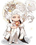
Posted: Fri Aug 31, 2007 8:33 pm
@ Hale Chreed
Alright, so it's kinda a complex avatar so I will break it down a bit by color. Your colors in use are red, green, white, and black if I see everything correctly. For the green, if you want to use it, you will have to put some on the bottom of your avatar because it's not even if you just have it on the head. Then it just makes the avi look disproportionate.
Fox ears and tail are cute, but you have to make sure, when you match them with red, that the reds are close in shade, which isn't really the case currently.
The black's pretty even I suppose, but I would suggest getting rid of the owl that your avi is currently holding, too much white around the chest and shoulders area.
Overall, 4/10
@ Tusyo
Sorry, I have rated you twice already. You will have to wait another week or two before I rate you again.
|
|
|
|
|
|
|
|
|
|
|
|
|
|
|
|
|
|
Posted: Sun Sep 16, 2007 2:18 pm
|
|
|
|
|
|
|
|
|
|
Posted: Thu Sep 20, 2007 4:36 pm
|
|
|
|
|
|
|
|
|
|
|
|
|
Posted: Thu Sep 20, 2007 7:50 pm
Could I get a rate, please?
I guess you could say it's a fire Kilik (Soul Calibur), although I wasn't really going for that when I made it.
|
|
|
|
|
|
|
|
|
|
|
|
|
|
|
Posted: Wed Dec 05, 2007 6:31 pm
Wow, I should get this place up-&-running once again!
0.o
I'm sorry~
Magedei, I could, but I don't know what avatar because you posted quite a while ago so I wil just start fresh again!
sweatdrop heart
|
|
|
|
|
|
|
|
|
|
|
|
|
|
|
|
|
|
Posted: Wed Dec 05, 2007 7:48 pm
|
|
|
|
|
|
|
|
|
|
Posted: Thu Dec 06, 2007 8:43 am
I do not believe I have been rated by you : )
Could you rate me please?
|
|
|
|
|
|
|
|
|
|
|
|
|
|
|
|
|
|
Posted: Thu Dec 06, 2007 12:10 pm
I can't really remember if I ever asked you to rate me, but if I did; can you rate me again ? whee
|
|
|
|
|
|
|
|
|
|
|
|
|
|
|
Posted: Thu Dec 06, 2007 3:30 pm
|
|
|
|
|
|
|
|
|
|
|
|
|
Posted: Thu Dec 06, 2007 5:36 pm
@ The Forgotten Bagel
So blue, yellow...and what color? Brown or white??
It's kind of confusing for me. Starting off, your blue shades don't mix very well. You have three different blues in three different spots: head, hands, and legs. I would suggest coordinating your blue hues. The saber lights emanating from the sides are random...and they don't really fit in where you have put them. The color's also to "bright".
As for yellow, which is everywhere btw, there's the dull yellow, which you have on your shoes...and the bright or gold-like yellow which is all over the top. Separate those out a bit more~
As for the jacket....it's completely out of place. It's a light brown...what's up with that?
Lastly, you have another out-of-place item: the cloak. It would go if your avatar had a "godly" theme using blue and yellow WELL, but that's not what the statement here is. It's more of a..."I kind of threw random clothes on and tried to match colors." statement.
I would suggest working on your avatar some.
Overall, 1/10
|
|
|
|
|
|
|
|
|
|
|
|
|
|
|
Posted: Thu Dec 06, 2007 5:42 pm
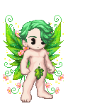
@ Wabbet
I like the whole "forest" thing you have going on...or at least, that's what it looks like it is. But a few things do bother me.
For one, your avatar's eye is red. I know it's an 'annoying to change' physical feature, but still. Green or yellow would work better. The skin matches though, good thing too!
Theme wise, the flashlight and eye glass are really just random to me. Why are they there??
The slight green touches on the head, chest, and leg areas are nicely put together.
I, personally, am not too big of a brown person, and putting too much on an avatar can really get boring...so maybe just slightly less brown...?
As for the yellow/gold touches, the crown sticks out more than anything else. Either get a bottom item to match, or don't add the crown. But adding an item can throw the theme off completely, so if you would prefer to keep it on, it’s not a big deal~
Overall, 5.3/10
|
|
|
|
|
|
|
|
|
|
|
|
|
|
|
|
|
|
|