|
|
|
|
|
|
|
|
|
 Posted: Sun Dec 31, 2006 3:58 pm Posted: Sun Dec 31, 2006 3:58 pm
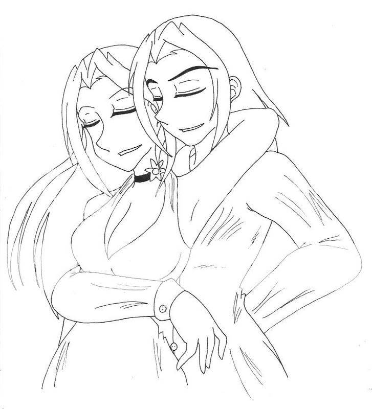
 This is my original character and her lover, my friends original character. I'm really terrible at drawing two characters intertwined with each other, so if I could get any ideas on how to make this better, I'd appreciate it. :] This is my original character and her lover, my friends original character. I'm really terrible at drawing two characters intertwined with each other, so if I could get any ideas on how to make this better, I'd appreciate it. :]
|
 |
 |
|
|
|
|
|
|
|
|
|
|
|
|
 Posted: Sun Dec 31, 2006 9:29 pm Posted: Sun Dec 31, 2006 9:29 pm
It's a good start! XD I think the noses are too large and the mouths are too far the the right, though. The guy's face is off porportion (the chin is too far to the right), too. And...that's all that I can see for now. XP Sorry... *is tired*
|
 |
 |
|
|
|
|
|
|
|
|
|
|
|
|
|
|
|
 Posted: Sun Dec 31, 2006 11:51 pm Posted: Sun Dec 31, 2006 11:51 pm
Not bad. ^_^ It has a good feel to it. Even if the anatomy isn't perfect, the viewer still gets a sense of motion and mood from it.
That being said... *cough* red-lines ahead.

(Note: I, uh, think I might've made the guy's arm too long. But it should still be a little longer than in the original.)
|
 |
 |
|
|
|
|
|
|
|
|
|
|
|
|
 Posted: Mon Jan 01, 2007 12:37 am Posted: Mon Jan 01, 2007 12:37 am
Well yeah I kinda do think the noses are too big and the breast line thing shouldn't be that high near the collar bone.
|
 |
 |
|
|
|
|
|
|
|
|
|
|
|
|
|
|
|
 Posted: Mon Jan 01, 2007 6:35 am Posted: Mon Jan 01, 2007 6:35 am
Sybex that was a truly outstanding and very helpful critique!
There should be more with your patience and critique skills!!
And I'd suggest varying the line weights, make some lines thicker, others thiner, just to add to the over all depth, it helps bring your work to life.
|
 |
 |
|
|
|
|
|
|
|
|
 |
|
|
|
|
|
|

