|
|
|
|
|
|
|
|
|
 Posted: Tue Jun 19, 2007 8:25 am Posted: Tue Jun 19, 2007 8:25 am
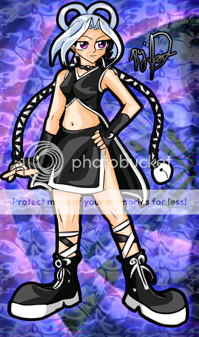
I don't color very well. in my own opinion.. but what you think? 
|
 |
 |
|
|
|
|
|
|
|
|
|
|
|
|
 Posted: Tue Jun 19, 2007 2:24 pm Posted: Tue Jun 19, 2007 2:24 pm
Wow, this is amazing....n_n
No critiques, except maybe use more shades for the hair?
That's about it.
This is incredible, I'm not kidding. You are GOOD at coloring, ok? >w<
|
 |
 |
|
|
|
|
|
|
|
|
|
|
|
|
|
|
|
 Posted: Tue Jun 19, 2007 11:17 pm Posted: Tue Jun 19, 2007 11:17 pm
well i was tying to do a basic cell shade type style.. and with a lot of anime colors usually consist of 2 to 3 to 4 colors and that is it.. usually tho about 2 or 3. This is what I wanted try and do and make the colors look rich and vibrant.
|
 |
 |
|
|
|
|
|
|
|
|
|
|
|
|
 Posted: Sat Jun 23, 2007 11:26 pm Posted: Sat Jun 23, 2007 11:26 pm
|
|
|
|
|
|
|
|
|
|
|
|
|
 Posted: Thu Jun 28, 2007 10:59 pm Posted: Thu Jun 28, 2007 10:59 pm
Nikko Sato I don't color very well. in my own opinion.. but what you think?  Quote: i think that you are good in coloring. biggrin hehehe..
|
 |
 |
|
|
|
|
|
|
|
|
|
|
|
|
 Posted: Fri Jun 29, 2007 4:37 pm Posted: Fri Jun 29, 2007 4:37 pm
you color really well...skin tones and all, i can't color like that, mine turns out all flat and bland....
|
 |
 |
|
|
|
|
|
|
|
|
|
|
|
|
|
|
|
 Posted: Wed Jul 04, 2007 6:51 pm Posted: Wed Jul 04, 2007 6:51 pm
I think the artwork is good. The only thing I could note is that there may be too high of a contrast between light and shadow on her dress--but that's more a style issue than anything. It might be a little easier on the eyes to see some more blending between the high-contrast areas. A little work with the blur or smudge tools makes this easy.
|
 |
 |
|
|
|
|
|
|
|
|
|
|
|
|
 Posted: Fri Jul 06, 2007 10:02 am Posted: Fri Jul 06, 2007 10:02 am
Its a good try at cel shading, but your light sources are not consistant. Her one leg looks like the light is coming from the left, where the other leg looks like the light is coming from the right. Keep your light sources consistant with each other. The rest will come with time.
|
 |
 |
|
|
|
|
|
|
|
|
|
|
|
|
|
|
|
 Posted: Wed Jul 11, 2007 6:15 am Posted: Wed Jul 11, 2007 6:15 am
Ithink your coloring just fine but yeah maybe use a little more shading for the hair, but other than that it's really good^^
|
 |
 |
|
|
|
|
|
|
|
|
 |
|
|
|
|
|
|


