Welcome to Gaia! ::

Reply The Anime Art Academy
Concept art

Quick Reply

Enter both words below, separated by a space:

Can't read the text? Click here

Submit

Do the kirby dance
>oo)> (^oo^)
100%
 100%  [ 9 ]
Total Votes : 9


Dark Bunny Lord

PostPosted: Mon Dec 03, 2007 12:08 pm


User Image


New inked Sketches:

Bleh, have a meeting with my cousin on Saterday to look over my portfolio for becoming a concept artist. He's going to give me tips before I turn it into his friend (the art director for a movie) a month or so after that point. Really wish I was better since I don't think my current quality of work will land me a job but hoping for the best expecting the worst.

Anywho, here's some of my newest inkings.
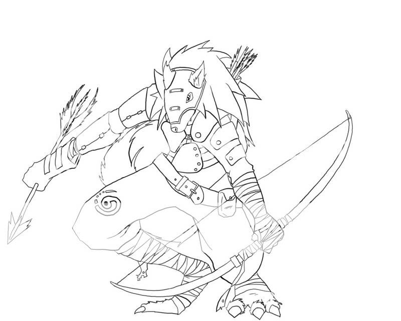
User Image
Meh this one was ok, need to re-go over some of the line qualities and of course detail (as I do with all of them but it's not to dissapointing.
Tips, etc are appreciated, pointless bad mouthing is best left out, I do see plenty of flaws myself and as such helpful friendly tips on how to improve are appreciated.

Note these are all original characters drawn from scratch with no referance. Most where so I could practice on different posses.
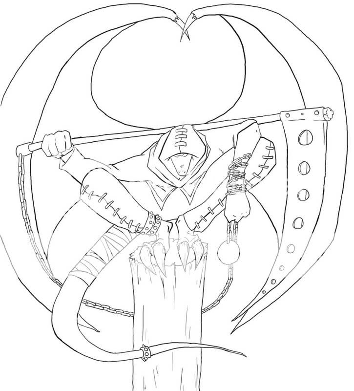
User Image
This was my favorite one and the first (if not only) one I plan on trying to color as such.
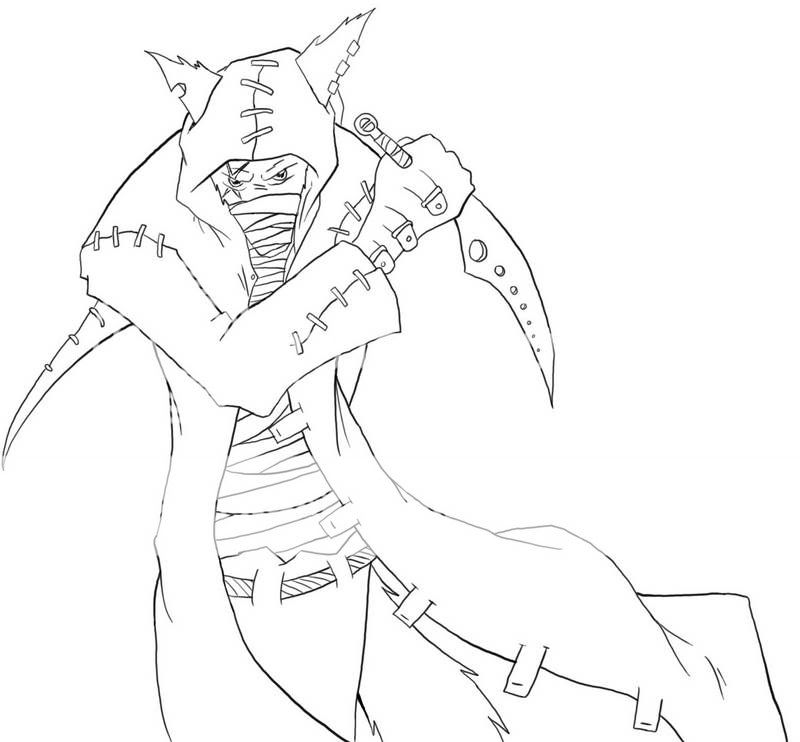
User Image
Actually hated how this one came out, the sketch looked a lot better sadly.
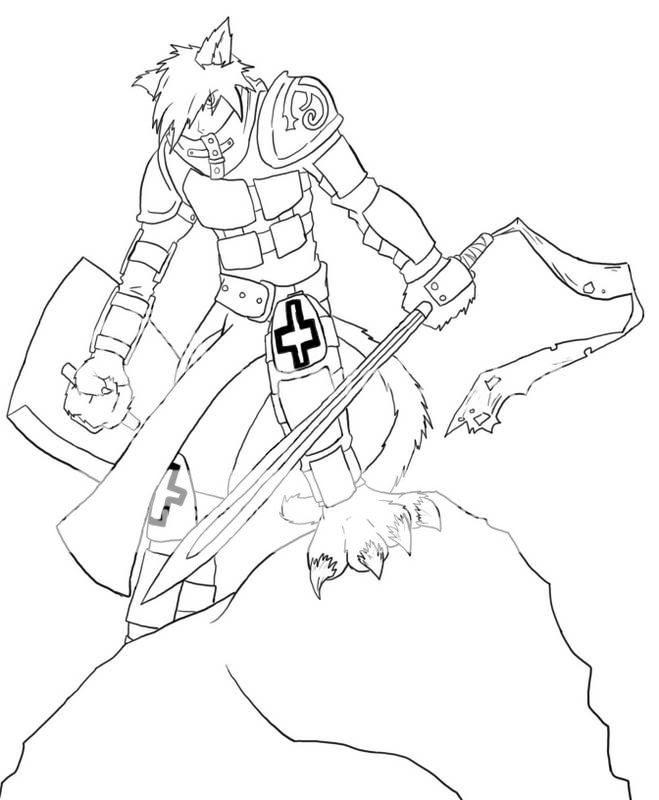
User Image
This one needs the most detailing work since the armor just looks bland without it, not to mention the fur.
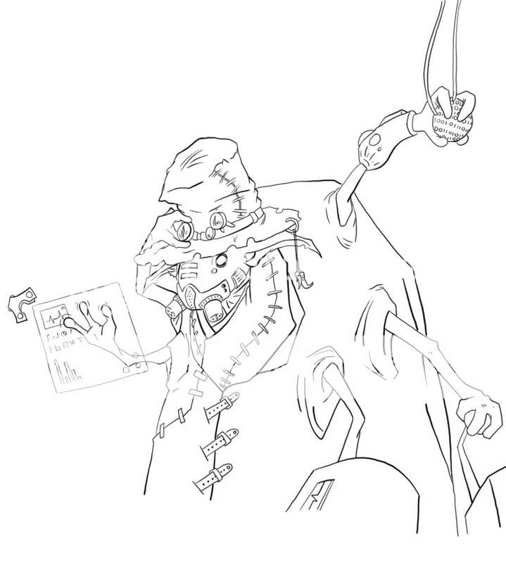
User Image
I liked this one, a bit of a change from my standard fantasy medivel type of drawing by trying out a more scifi feel.
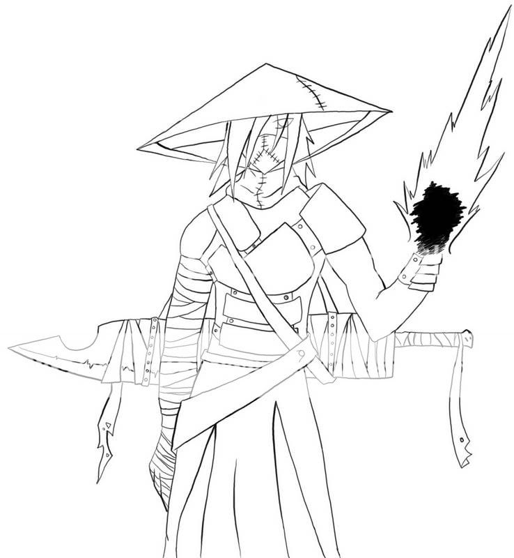
User Image
Meh ok, once more needs a ton of detailing before it's complete.
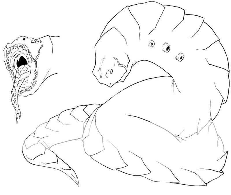
User Image
My first attempt at a somewhat non-humanoid... thing

User Image
PostPosted: Mon Dec 10, 2007 7:37 pm


Man am I jealous of your posing and inking skills. >_>; I don't love the concept of this one. <3 For the first one, his right arm gets too thin too soon, and is a bit too long. His left arm (where it connects to his chest) is a little odd. My suggestion for his left leg is to have his other toes showing a little. And you may want to add whiskers. The angle on the head for the helmet/nose/his right ear is a little off. You may want to work on/get some refs for bows (I hate drawing them, they're so complex for a simple thing, ey?) - the top of the arch isn't balanced with the bottom [I know nothing about bows; I don't actually know if this is right or not... @.@]. The back of the right leg could use a little more definition.

This has got to be really difficult to handle foreshortening on this one's pose. >_>; His right leg looks a little wide and funky compared to the other leg, the bottom of it should come in more. You did a really great job with the part of the chain that's wrapped around his arm, although it could be a bit more 3D looking. :3 I'm not sure if I like this type of wing (this is my personal opinion, however)- they're not very dynamic and hold more of a blobby-simple feel. When you color them you may want to add an interesting texture and pattern to make them more interesting.

I think the jaw and cheek lines need more definition with line width. If you can redo the face - try, the eyes aren't even (or the same size) and try making the wrinkles on the nose a little less prominent. The ears aren't the same length, unless that was your intention, try shortening the left one to match the right. I'm not sure if the belt was meant to be rope or not, but try to define what type of material that is a little better next time. :3

This one has a pretty cool armor design, the chest plates aren't an overly used arrangement. biggrin The sword is a little boring (and the shield as well), but you did the ribbony-thing really well. The chloth on this one looks especially stagnant, try making it more dynamic like you did with the ribbon. Keep in mind that most concept art places look for a more realistic or suedo-realistic anime style; don't be afraid to try multiple ones. The legs here are a little awkward and there's a size issue between the foreshortened and distant one. Watch the hip area of your anatomy on this one as well. The eye is also at a bit too extreme slant.

Okay, you got me. I adore this concept. >:9 Not only is the line width really dynamic, but it's just a really cool character species. Where's his third arm on (his) right? You might want to add that. :3 The outfit is really wicket too. >:0 Be weary of the line that is equal with his back - lines like this one can sometimes make it look more 2D than 3D, which this one is rocking at.

The bottom of his left arm (the entire length of it) is a bit odd. Watch the slope of the neck and shoulders here, it's a little too extreme. Also the sword is a bit reminiscent of Cloud's (FFVII) buster sword- [pretty much any thick sword can pull this up *but* you have to consider how popular the game is and how often it will be compared to that...). The hat, because of it's sharp angles, looks a little more 2D than 3D, so you may want to round them a little bit. If that's fire on his left hand (if it's not, ignore this) but it looks very stiff - fire's very wild and will never have such sharp angles in it. :3 Try elaborating the eye to a different style, it's a little simple as is and the hair's also a bit unnaturally angular (suggestion, only). I suggest you try doing a cloth study for folds and shapes and such. biggrin

I like this one, especially the splotchy tongue. > biggrin I want one of these as a pet. A few of the scales need a little more line width definition. This works well for a basic monster design, but could use some more elaboration in way of detail. Really good for a first attempt (you should see mine- they're terrible ^_^; ).

I hope your critique with your cousin went well, a friend of my brother's did something similar for my work over the summer. It's really helpful to have a lot of input from one person who knows what they're talking about. biggrin Good luck, anyhow. :3 It's been over a week since you started the topic, I just hope you come back. ^_^;

beks

4,900 Points
  • Cart Raider 100
  • Happy Birthday! 100
  • Alchemy Level 1 100

Dark Bunny Lord

PostPosted: Sun Dec 16, 2007 9:30 am


User Image


Thanks for the honest critique it's greatly appreciated.
As for the 6th pic though it doesn't look like fire on his hand because... well... it's not supposed to be fire on his hand lol. It's more of just a mystical energy coming out in a violent fashion, raw magic forming a small blade or something to that extent.

User Image
PostPosted: Wed Dec 26, 2007 10:49 am


Be carefull with your proportions even though they arent all hum creatures you still need to watch the proportions because some of them look a little off with the proportions. Another things is watch the angles, remember when the screen is looking from a certian angle everything has to be at that angle. domokun

Hayami_kiri


Bleu_Fyre

350 Points
  • Gaian 50
  • Member 100
PostPosted: Sun Jan 06, 2008 11:54 pm


Sweet! heart  
Reply
The Anime Art Academy

 
Manage Your Items
Other Stuff
Get GCash
Offers
Get Items
More Items
Where Everyone Hangs Out
Other Community Areas
Virtual Spaces
Fun Stuff
Gaia's Games
Mini-Games
Play with GCash
Play with Platinum