|
|
|
|
|
|
|
 Posted: Sat Sep 16, 2006 11:26 pm Posted: Sat Sep 16, 2006 11:26 pm
Well... more an improvement than a style...  This was done before I used my new style...  This was done in a transition between old and new...   These were done using a more refined version of my style.
|
 |
 |
|
|
|
|
|
|
|
|
|
|
|
|
 Posted: Sat Sep 16, 2006 11:43 pm Posted: Sat Sep 16, 2006 11:43 pm
i like all your coloring styles..^^
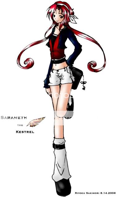
in the first one, i liked the way you colored her legs [and your signature xP]
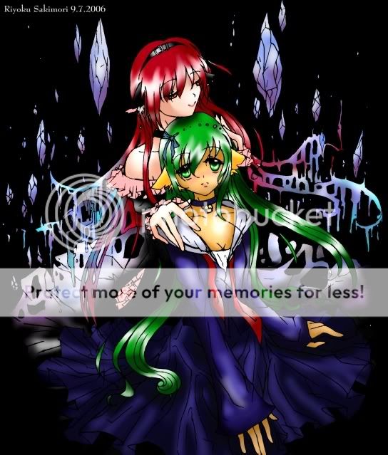
in the seconds one, i like the composition and the background and how you blended it into her hair.
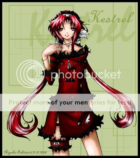
in the third one, i like how you shaded her skirt and...leg band...
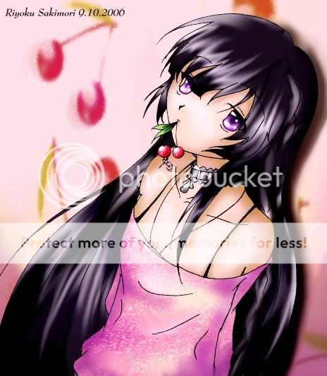
in the last one, i like her shirt [and the cherries].
overall, you color hair very well. i think you should color more of your clothes like the skirt in the third picture and shaded near the folds.
since your first picture is kinda small, i'd use a smaller tracing line, at least near the top. However, you have a really professional drawing style...it's really great.
|
 |
 |
|
|
|
|
|
|
|
|
|
|
|
|
|
|
|
 Posted: Sun Sep 17, 2006 8:17 am Posted: Sun Sep 17, 2006 8:17 am
wh00t! Thank you for the advice... uh...
oh yes, what's a tracing line? Neh? sweatdrop
|
 |
 |
|
|
|
|
|
|
|
|
|
|
|
|
 Posted: Sun Sep 17, 2006 2:35 pm Posted: Sun Sep 17, 2006 2:35 pm
>> err...just that...outline. yeah. i'm bad with words.
|
 |
 |
|
|
|
|
|
|
|
|
|
|
|
|
|
|
|
 Posted: Sun Sep 17, 2006 2:44 pm Posted: Sun Sep 17, 2006 2:44 pm
Wow! I really love the first one alot!
Do you have a DA Account?
|
 |
 |
|
|
|
|
|
|
|
|
|
|
|
|
 Posted: Sun Sep 17, 2006 7:00 pm Posted: Sun Sep 17, 2006 7:00 pm
*too tired for paragraphs*
Good points:
- I like the hair lots. It is shiny and flowy, and shall thus be stared at as all shiny objects should be. =3
- Good basic drawings. I like the dress design in the red-head picture.
- Definately an improvement. The shading and highlights make more much more sense.
Bad points:
- It's (still) really smooth. Nice for hair, but on the skin and clothes it looks rather rubbery.
- The airbrush (?) strokes look... like airbrush strokes instead of a natural part of the clothing. If you did more of what you did with the hair highlights on the clothing, I think it'd look better.
- The eyes have no whites. Kinda creepy. O_o
|
 |
 |
|
|
|
|
|
|
|
|
|
|
|
|
|
|
|
 Posted: Mon Sep 18, 2006 12:05 am Posted: Mon Sep 18, 2006 12:05 am
o wow~ i especially love the kestral pic =D great lineart
|
 |
 |
|
|
|
|
|
|
|
|
|
|
|
|
 Posted: Mon Sep 18, 2006 3:50 pm Posted: Mon Sep 18, 2006 3:50 pm
|
|
|
|
|
|
|
|
|
|
|
|
|
 Posted: Mon Sep 18, 2006 8:55 pm Posted: Mon Sep 18, 2006 8:55 pm
The first and last I like a lot, very solid composistions. It's the middle two I have a problem with. How should I say this....they don't have very much contrast in the colors. When I first look at them, I don't know where I'm supposed to focus on. Usually if the subject is a person, you want people to start at the eyes and pan out from there. So I would find a way to emphasize the eyes and make them really stand out. I suggest using either significantly lighter or darker colors on the eyes. Since you use a lot of darker colors (which I love by the way. I see a lot of people who are afraid to use less vivid colors) I would suggest using lighter colors for the eyes. But that's just my opinion. But, overall, really amazing job! Once again, you have a great sense of color selection, peticularly in the 3rd pic. The red and gree works nicely without making me think "Christmas!^^" Keep up the great coloring.
|
 |
 |
|
|
|
|
|
|
|
|
|
|
|
|
 Posted: Tue Sep 19, 2006 8:32 pm Posted: Tue Sep 19, 2006 8:32 pm
wh00t! COMMENTS!!!
Commenting Replies now...
- My DA is RiyokuSakimori
- Shark gives good critique ^^ I will somehow use her advice! As soon as I figure out how to shade non-hair stuff on teh compy... (This is like... my second year using a compy... and my third year actually drawing anime... >.>;;; I'm still learning desperately...)
And yesh, I always forget to draw the whites sweatdrop I'm forgetful! >.>
- Epsilon The one with the two cat girls was a commision.... I had like... no choice of colors >.> I dunno... confused But you're right! It looks really wierd... What's wrong with Christmas besides it's a religious holiday? I get to burn giftwrap! ^^
|
 |
 |
|
|
|
|
|
|
|
|
|
|
|
|
|
|
|
 Posted: Tue Sep 19, 2006 9:27 pm Posted: Tue Sep 19, 2006 9:27 pm
Ohmigawd. I luff it. Your pictures are awsome!!!! I like how you color it and how your second one looks like chobits!!!!!!!!! biggrin Its awsome!
|
 |
 |
|
|
|
|
|
|
|
|
|
|
|
|
 Posted: Mon Sep 25, 2006 8:51 pm Posted: Mon Sep 25, 2006 8:51 pm
|
|
|
|
|
|
|
|
|
|
|
|
|
 Posted: Wed Oct 11, 2006 7:28 pm Posted: Wed Oct 11, 2006 7:28 pm
ooooooooooooo i like your style! very unique! i like the last one alot! it reminds me of my ffuits basket fan-fic character........
|
 |
 |
|
|
|
|
|
|
|
|
|
|
|
|
 Posted: Mon Oct 16, 2006 9:09 am Posted: Mon Oct 16, 2006 9:09 am
The piece you did on 9/13 is fantastic. The highlights and lowlights are almost perfect. Particularly her bust and shirt. You really made her appear to be in 3D.*applauds*
|
 |
 |
|
|
|
|
|
|
|
|
|
|
|
|
|
|
|
 Posted: Tue Oct 17, 2006 6:15 pm Posted: Tue Oct 17, 2006 6:15 pm
very well done especially with chossing the colors. I love how in the hair in your 2nd picture fades in to the background and turns to black to make the subject themselves stand out from the background. On the first i thought it was too long at a glance but the legs really just stand out and give her a tall skinny look. Your 3rd pic was my favorite i love how you shaded the folds and how the hair took on the shiny look but still matched in with the outfit and didnt go too shiny. Your 4th one was colorful to say the least and the face stands out from all the color still so good job but wat kind of software are you using to color these and are you scanning your pictures or drawing them on the computer??
|
 |
 |
|
|
|
|
|
|
|
|
 |
|
|
