Starlit-Chan
RikuDrak
Not bad, some anatomy looks a little wonky and the colouring needs a little more definition, but other than that good job.
Could you help give me an example on how the anatomy is wonky ^^;
Ah sure, sorry this isn't my main computer so I can't visually show you, I'll try and type it out (my main computer is "feeling ill" and needs a motherboard repair).
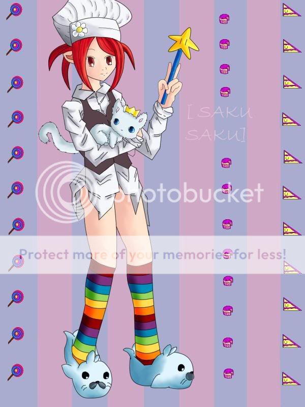
In the first one with the girl, her wrist looks a little larger than it should be (I have trouble with wrists/hands as well x.x) and it doesn't look like it connects to an arm that fits in the shirt. You measured the wrist to the part of the shirt touching it, which is a bulge compared to the thinnest part of the sleeve.
Also, the upper arm is longer than the lower in the one holding the wand. The elbow should be moved up just a little more. And her right eye (our left) seems to be a bit out of place. Maybe move it more to our right?
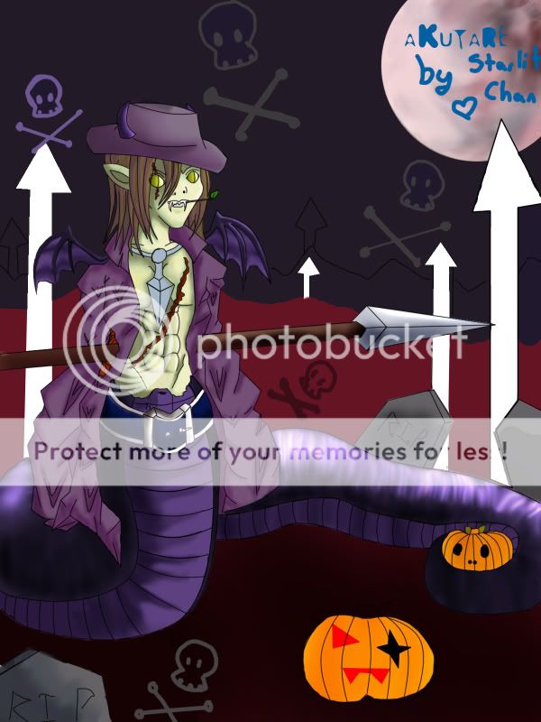
In the second one (the body is done well btw) the snake body seems a tad off, the underbelly tapers towards the bottom front before it touched the ground and then goes out. I don't know if that made much sense, but try to keep it more or less straight, where when it seems to move at an angle under the body it stays and does not come out towards us.
Sheesh its easier to explain that last one visually ^^; I'm sorry if you can't understand it.


