|
|
|
|
|
|
|
|
|
 Posted: Wed Nov 08, 2006 3:27 am Posted: Wed Nov 08, 2006 3:27 am
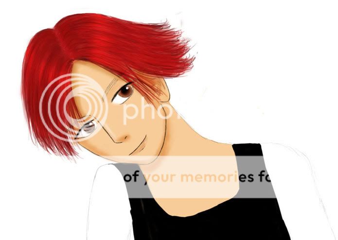
Hi. I'm new... um... this is my first submission for critique. I mainly need help on shading, so comments are always welcome. This first one is of my avatar. It's not completely done, but I'd like to get some feedback though. Thanks! sweatdrop 
|
 |
 |
|
|
|
|
|
|
|
|
|
|
|
|
 Posted: Wed Nov 08, 2006 5:02 am Posted: Wed Nov 08, 2006 5:02 am
Ooooo....the hair is wonderful! heart Very nice; very fluid in design. It is really quite beautiful.
Unfortunately, I don't think it quite matches the rest of the picture's style. Something seems inconsistent; like the image is composed of two separate pictures pressed together into an awkward combination. I think it is because the hair is so fluid and without much line--but the face and body have harsh lines outlining them. I know you said you weren't finished yet, so I'll look past the lower half of the body for now. But, are you finished with the face yet? I think in order for the picture to look more natural and balanced, you should try shading the face without the lines in it. Rely on shadow and color alone, take out the lines. Either that or add some lines into the hair (outlining it in a similar style as the face), which I think is a mistake personally. I like the style of the hair without the lines, and think maybe the rest of the picture could benefit from this lack of lines as well.
|
 |
 |
|
|
|
|
|
|
|
|
|
|
|
|
|
|
|
 Posted: Wed Nov 08, 2006 7:47 am Posted: Wed Nov 08, 2006 7:47 am
Wow, the hair looks just austounding, although the rest of the pic seems to lack detail. Never the less the hair is just... wow, anyways keep it up looks like this may turn out great if you keep working on it.
|
 |
 |
|
|
|
|
|
|
|
|
|
|
|
|
 Posted: Wed Nov 08, 2006 1:43 pm Posted: Wed Nov 08, 2006 1:43 pm
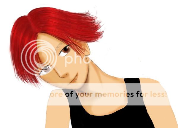
Second try. Hopefully this looks better... crying 
|
 |
 |
|
|
|
|
|
|
|
|
|
|
|
|
|
|
|
 Posted: Wed Nov 08, 2006 2:52 pm Posted: Wed Nov 08, 2006 2:52 pm
Coming along well! I'd suggest adding a bit more detail though, indeed the skin looks a little drab compared to the hair. Add highlights, very very subtle highlights. Maybe even try adding another colour very subtly to the skin tone to bring it life. Subtle is the key! A reddish/pinkish? Yellowish? Try whatever looks best.
|
 |
 |
|
|
|
|
|
|
|
|
|
|
|
|
 Posted: Wed Nov 08, 2006 9:11 pm Posted: Wed Nov 08, 2006 9:11 pm
I think its really good but to me the lips are a little too thin.
|
 |
 |
|
|
|
|
|
|
|
|
|
 |
|
|
|
|
|
|


