|
|
|
|
|
|
|
|
|
 Posted: Mon Jan 01, 2007 9:21 pm Posted: Mon Jan 01, 2007 9:21 pm
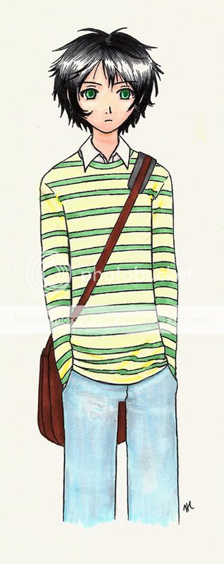
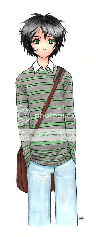
If you hang around the Picture Post, you've probably already seen this. First of all, I want to know which version is better. I also want general C & C, because I want to improve. (By the way, I'm still trying to figure out my Copics so I'm fully aware that the color is...not blended so well.)   And the yellow version is also on Deviantart if you prefer to comment there: http://www.deviantart.com/deviation/45718033/
|
 |
 |
|
|
|
|
|
|
|
|
|
|
|
|
 Posted: Tue Jan 02, 2007 3:25 am Posted: Tue Jan 02, 2007 3:25 am
nice work you have there hanakaizoku biggrin
mm, it's a tough choice, but some how I'm drawn to one with the grey top. Maybe something I feel about the colours being a bit blended on that one, and the grey top ^^.
|
 |
 |
|
|
|
|
|
|
|
|
|
|
|
|
|
|
|
 Posted: Tue Jan 02, 2007 3:29 pm Posted: Tue Jan 02, 2007 3:29 pm
rhyswinterz nice work you have there hanakaizoku biggrin mm, it's a tough choice, but some how I'm drawn to one with the grey top. Maybe something I feel about the colours being a bit blended on that one, and the grey top ^^. Thank you. 3nodding
|
 |
 |
|
|
|
|
|
|
|
|
|
|
|
|
 Posted: Tue Jan 02, 2007 7:50 pm Posted: Tue Jan 02, 2007 7:50 pm
I like it too, very nice. The only problem I can see is that when someone has their hands in their pockets, there's a little bit of a bulge where their hands are. I like the one with the gray top too, but mainly 'cause I'm not a huge fan of yellow. ^_^
--x--Momo--x--
|
 |
 |
|
|
|
|
|
|
|
|
|
|
|
|
|
|
|
 Posted: Tue Jan 02, 2007 8:21 pm Posted: Tue Jan 02, 2007 8:21 pm
|
|
|
|
|
|
|
|
|
|
 Posted: Tue Jan 02, 2007 9:32 pm Posted: Tue Jan 02, 2007 9:32 pm
Hm, very nice. Your drawings remind me of pictures from a Sesshoumaru story I read a while ago on quizilla. It was a very good story, and I liked the pictures too.
Anyways, its a very nice picture. I think I prefer the gray one more. It matches more with what his personality seems to be. And I'm not sure yellow and green look so well together. The character looks very harry potterish to me I think. Messy black and green eyes. Keep up the good work.
|
 |
 |
|
|
|
|
|
|
|
|
|
|
|
|
|
|
|
 Posted: Tue Jan 02, 2007 10:26 pm Posted: Tue Jan 02, 2007 10:26 pm
Momo Shimizu: Thanks. Yeah, I guess I kind of forgot the bulge when I colored this. o_o; Thanks for pointing it out. heart
Raspberry Jello: Thanks. whee His personality isn't like his expression here, though--he's more of a jerk. Someone else told me it reminded them of Harry Potter, too, haha. Yellow and green kind o look bad--I was going for a cream but put too much on. D': Alas, traditional media.
|
 |
 |
|
|
|
|
|
|
|
|
|
|
|
|
 Posted: Wed Jan 03, 2007 1:45 am Posted: Wed Jan 03, 2007 1:45 am
he's cute -ㅂ-
the gray one i prefer, but you should add the tan background to it like you did to the other one.
your proportions are good, so all i can say is to add more detail to your clothes (especially the pants) and to add more depth to your shading (the face is good though)
|
 |
 |
|
|
|
|
|
|
|
|
|
 |
|
|
|
|
|
|


