|
|
| Which do you like best? |
| The fanart. |
|
20% |
[ 1 ] |
| The original. |
|
40% |
[ 2 ] |
| Both. |
|
40% |
[ 2 ] |
| Neither! Put down your pencil and pens forever, fool! |
|
0% |
[ 0 ] |
|
| Total Votes : 5 |
|
|
|
|
|
|
|
|
 Posted: Mon May 28, 2007 12:50 am Posted: Mon May 28, 2007 12:50 am
So these are two recent linearts that I am quite proud of, although I would apreciate some critiqueing.
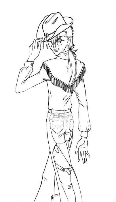
First, the fanart:

Yes, it's a hickified Chichiri. Why? Because I live in a town with cowboys, I'm afraid. That and the image was just... well, funny. xd
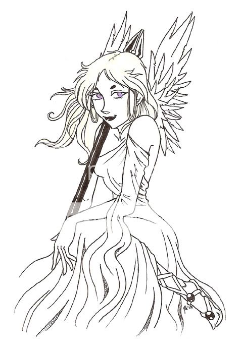
Second, the original:

This is a muse that I drew for an english project. I know the coloring of the hair and eyes is bad and it was a mistake that I wish I could fix. Unfortunately, it's nearly impossible to ratify.
Thank you for your imput!
|
 |
 |
|
|
|
|
|
|
|
|
|
|
|
|
 Posted: Mon May 28, 2007 11:11 am Posted: Mon May 28, 2007 11:11 am
OMFG you can draw hands!!! I can't draw hands for my life...it looks great, i'm not that advanced so i can't critique your stuff, but nothing looks off from what i can see...except for some reason the hair on the left....of the muse i mean...is it just me or is it a bit high? idk...well good work!!!
|
 |
 |
|
|
|
|
|
|
|
|
|
|
|
|
|
|
|
 Posted: Mon May 28, 2007 5:31 pm Posted: Mon May 28, 2007 5:31 pm
Your line variations are awesome. @_@ Especially on the Chichiri fanart. I really like the pose on that artwork.
As for the muse, I'm impressed by the detail you placed on the wings. I do find that however, that the way the muse's hair has detailed strands on some parts and not on others somewhat distracts me. I'm not sure why, but I think consistency on hair strands might look better. (No need to modify your actual work though. Maybe photoshop on it to see how it looks?)
I also find something a bit off with the way the bottom part of the sleeve falls. Ack...don't know how to explain that. (Sorry.) In general, I like the way the folds flow through the work are fluid. You have a lot of nice fluidity in your lineart.
|
 |
 |
|
|
|
|
|
|
|
|
|
|
|
|
 Posted: Wed Jun 06, 2007 11:02 pm Posted: Wed Jun 06, 2007 11:02 pm
Thank you both very much for your critiques!
-XxrandomdumbnessxX, the hair may be a bit high. ^^; As for the hands... Well, I hate to sound like everyone else, but practice practice practice! (And honestly, these are two of my better things... usually my hands end up looking a little odd.)
- GB girl, thank you very much. I'm glad the lines work. ^_^ Yeah, the muse's hair kinda bugs me a bit too, but when I try to do detailed hair it usually ends up looking terrible. ^^; I'll do what you suggested and try photoshoping in some more details.
|
 |
 |
|
|
|
|
|
|
|
|
|
 |
|
|
|
|
|
|


