|
|
|
|
|
|
|
|
|
 Posted: Thu Jul 05, 2007 6:52 pm Posted: Thu Jul 05, 2007 6:52 pm
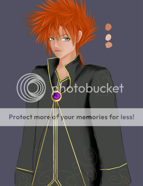
This is a wip ( work in progress to some that may not know) this is takeing me forevers... but i got the hair done and the eyes I think is not going to change anymore.. 
|
 |
 |
|
|
|
|
|
|
|
|
|
|
|
|
 Posted: Fri Jul 06, 2007 1:46 am Posted: Fri Jul 06, 2007 1:46 am
Looks quite good so far. The lips may be just a tad close to the mouth, but that's just nitpicking on my part.
|
 |
 |
|
|
|
|
|
|
|
|
|
|
|
|
|
|
|
 Posted: Fri Jul 06, 2007 6:52 am Posted: Fri Jul 06, 2007 6:52 am
KiyoshiKyokai Looks quite good so far. The lips may be just a tad close to the mouth, but that's just nitpicking on my part. explain? the lips are part of the mouth how can they be to close to it? i am not understanding your statement lol.
|
 |
 |
|
|
|
|
|
|
|
|
|
|
|
|
 Posted: Sat Jul 07, 2007 7:03 am Posted: Sat Jul 07, 2007 7:03 am
Somehow that got jumbled up. I meant that the lips may be too close to the nose. My bad. sweatdrop
|
 |
 |
|
|
|
|
|
|
|
|
|
|
|
|
|
|
|
 Posted: Sat Jul 07, 2007 10:46 am Posted: Sat Jul 07, 2007 10:46 am
KiyoshiKyokai Somehow that got jumbled up. I meant that the lips may be too close to the nose. My bad. sweatdrop thanks I did move the lips down a bit. :F because I kinda noticed that aswell.. after I looked at it for a wile.. Picture updated BTW
|
 |
 |
|
|
|
|
|
|
|
|
|
|
|
|
 Posted: Sat Jul 07, 2007 6:41 pm Posted: Sat Jul 07, 2007 6:41 pm
It looks good, and I like the coat design. Shading is not bad either.
Be careful of straight lines on the coat though, as they may take depth out of your picture. The main thing to note now is that the shoulders seem a little stiff. You can fix this by making the shoulder slope downward from the neck, rather than projecting directly outward. Even if the character wears padded shoulders, they should still slope down slightly, maybe a 15 degree angle or so. You may want to shade the coat underneath a little bit more, to give it some depth against the overcoat.
That said, it looks like the work is coming along well. Keep it up. biggrin
|
 |
 |
|
|
|
|
|
|
|
|
|
|
|
|
|
|
|
 Posted: Sat Jul 07, 2007 9:57 pm Posted: Sat Jul 07, 2007 9:57 pm
KiyoshiKyokai It looks good, and I like the coat design. Shading is not bad either. Be careful of straight lines on the coat though, as they may take depth out of your picture. The main thing to note now is that the shoulders seem a little stiff. You can fix this by making the shoulder slope downward from the neck, rather than projecting directly outward. Even if the character wears padded shoulders, they should still slope down slightly, maybe a 15 degree angle or so. You may want to shade the coat underneath a little bit more, to give it some depth against the overcoat. That said, it looks like the work is coming along well. Keep it up. biggrin lol he just summed it up....is it just me, or do the eyes look feminine, anyways good work...
|
 |
 |
|
|
|
|
|
|
|
|
|
|
|
|
 Posted: Sun Jul 08, 2007 5:12 am Posted: Sun Jul 08, 2007 5:12 am
The ear is way too far up. Top of the ear should be at the same height as the eyes, maybe a little bit higher.. definitely not as high as you did. His hair is sprouting out from completely random places. Even if it's a messed-up/standing up hairdo, the hair still grows out of the skull and isn't lying horizontal on top of other hairs like you did in the middle.
And his jaw/cheekbones on the right side of his face seem to have disappeared; might make those a bit more pronounced because now it looks like it's on straight line from the chin to the forehead, which is not how faces work.
Maybe make the white of the eyes a bit less bright, it would work fine with manga style coloring but seeing as the skin is a bit more realistic, it would look much nicer if the eyes were a bit softer too instead of bright white.
And the shoulders look kind of stiff indeed, but that's already been said.
|
 |
 |
|
|
|
|
|
|
|
|
|
 |
|
|
|
|
|
|


