
liquid.pearls
UGH *DIES* ; O; gaia ate my long-a** post. <////////3
*HAVETOSTARTOVER* DDDDDDDDDDDDDx
DDDx UGH, hOW IRRITATING. HERE IS MY POST-- MUCH SHORTER THAN BEFORE:
'ELLO AGAIN. I'm Pearls. :D (again)
I'm a Gaian User who loves long walks on the beach, currently of 14 years of age, that has been here since March 21, 2004. I am online everyday for at a minimum of 4 hours. I have attended Gaia Panels at Fanime Con o4, and Otakon o5. I am a monthly donator, and a consumer of GaiaOnline products (such as tee shirts, etc. etc.)
 I first found gaia from a little banner that looked something like the one on the side x3
It was located on a side bar of a random Xanga page I was browsing. x3 It was a very cute banner, so of course I clicked the image. It brought me to HERE.. 'Go-Gaia.com' or what is now 'GaiaOnline.com'.
In this post I will describe (ONCE AGAIN TT ^TT) my feelings about the new layout, and how to improve it? I realise that -we are not getting our old layouts back- and signing any petitions to ask for something like the such is simply pointless.
All I can do is sit back and provide as much helpful information and suggestions as I can on what could be a better approach to a new layout next time around. ^^ <3
I've organised this post in sections, I will adress each thing that is stated in -bold && underlined-. Attempt to look at it as a sort of outline, used to draft essays and such. Now I will begin..
LET US REVIEW...
 Go-Gaia! // Original Framework
GaiaOnline was started by a couple of room-mates and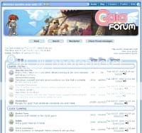 such wanting to create a.. link list of anime sites? Something like that. xD;
They copied ideas and such from popular video-games they enjoyed, and other sites.. picking out the ideas that made these concepts so addicting-- which is pretty cool. What they developed was something so radical in popularity.. I don't think they even began to realise. xD;
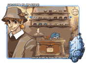
They developed something like the pictures you see in the post right now.. it was a cool feel, angelic hues matching the current items and and a colour scheme to die for. It was 'Go-Gaia.com'! It was what it was.
You'd run into the usual 'sushi server is busy' post, and Gaia lagged LIKEMAD. But still we stayed x3
It was FUN, and the layout was GREAT. Simple links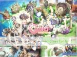 were located at the bottom of the header, and you used to use the map as your basic navigation for the site. It was all very useful. <3
The Art that was featured on gaia in banners and such was of anime nature, in anime-type style that mainstream fashions go for (e.g. - wild hair colours, big eyes of weird nature, outfits that imitated body parts of a cat, SWORDS.)
Now remember, there were no gambling games,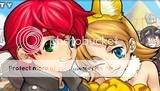 no 'Towns' program, very little item updates, down-town maintenance LIKEWHOA, no Journals, profile pages were just a wandering thought, and it was all very quant. x333
The layout was extremely simple, and user (along with guest) friendly. Simplicity! The only unorganised part that comes to mind would have been the forum link page, which was not sectioned out at all. <3
Oh old gaia! Your angelic-ness was a beauty of it's own. x3 Now.. this may all seem welcoming by myself-- only because this is what made me join :D.
Update NUMBER-O UNO!
 The first update was only slight.. it was a navigation bar that was purple-tinted-ish. D; it wasn't much..
but I feel it bookmarked a turning point in Gaia's style of layout.
As you can see in the picture, this is when the look of the navigational bar started to form.
It was a bar underneath the banner claiming to the forums.. and it led you to most conveinant places.
There were no sub-links underneath it, thiswasit. x3
Update-- TAKE TWO!
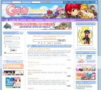
The second layout update was MADNESS. @____@
It was ALL pruple! OOO:
This was outrageous of course, just as outrageous as it is now. However, I feel that the last update I was more fond of than this one. I feel this one lacks a bit in some areas.. but we will get into that later ;]
People were utterly DISGUSTED. Gaia's colour scheme had strayed from it's original path - angelic hues, I say!
The colour scheme differed a great deal, but the navigational system was more than handy for me. However.. I am a child of 7 computers, and three network systems in my household.. so the flash, or whatever program that was used, was amazingly conveinant! I imagine for those using dial-up that it was disgustingly annoying to load.
 Things were added to the front page 'AVATAR SPOTLIGHT!' and item updates were an extreme advantage x3
We got sneak peaks of 'COMING SOON' and there was a little calender when it came round to Anime Convention time! OO:!!!
This was pretty exciting.
The only downfall was the map u____u <3
The poor little map had been used THE HELL OUT OF before, for it was the base of navigational system, HOWEVER during this layout transformation the navigation bar had become so conveinant.. that no one visited to map anymore besides events. >____o;
This is pretty depressing, seeing as it's the key image as to what your little avatar pixel person is living in.
TODAY'S LAYOUT!
@___@ In this section I will work MORETHANALLTHEOTHERSECTIONS.
I plan to dissect every single part of the layout that has been changed.
THELOGO: I /MUST/ first address the currently logo. gonk
DO YOU SEE IT?! CAN YOU SEE THE LOGO?! gonk gonk
It's very cute.. really. Dx but it IN NO WAY relates to GaiaOnline, or even Anime all together.
They aren't even CHIBIs!!
WHERE ARE THE OVERSIZED EYES?! THE PINK HAIR?! DDDx
It's very depressing, that you aren't showing pictures of GAIA PEOPLE on GAIA ONLINE.
 You can counter that comment with 'yes.. but we show avatar spotlight, and now PROFILE SPOTLIGHT, and FISHING SPOTLIGHT, and NEW MEMBER SPOTLIGHT!' but in all honesty.. it doesn't matter. D;
We want to see the administration's artwork of gaia.. the SIGNATURE artwork that the storylines go by, the map goes by, and the whole SITE goes by. That is what we want. We do not want lounging random civilians in the Bahamas. Dx We don't go to the Bahamas! We sit at our computers viewing YOURWEBSITE. Dx We want art we cannot get ANYWHERE ELSE.
The layout is now very white. D:
I'm not sure if you're just not done with it, or if this is it.
Dx I read the announcement and it states that some more space was requested. This is understandable, but in the end.. I feel like you might have manipulized this concept in the wrong aspect. >___<;
D; I feel the space is not evenly distributed, where the past layout did not feature much space, but it was organized.
This layout feature space, but it all feels so lost, and very unwelcoming.
I feel in this layout we have digressed from the proper 'pineapple-come-and-stay-at-my-website' type graphics, and are edging towards something less organised. If you just add a couple of tables to at least put my avatar SOMEWHERE instead of just floating up in the corner. ><
Right now the feeling I get on this website, is that it's no longer a PLACE to escape to from family.. and conflict elsewhere, but a website. This was not the previous scene that GaiaOnline provided.
I will now make a list of 'Thank Yous' & 'No Thank Yous'
I feel it's rather polite to say thank you for the thing I like, and 'No Thank You' is a nice way of saying.. well.. 'No Thank You' xD;
Thank You Gaia:
+Personlized 'Channels' so I can view what my ACCOUNT has to do with the world <3
+Gaia Statistics - I really like this option, because I like FACTS x33
+'World Map' under 'WORLD' option - <333 this is an easier way of getting around, and I can see how everything looks from a bird's eye view <33333! ♥ ♥ ♥
No Thank You Gaia:
+ Gaia 'A-Z' - I don't feel it's needed, All of our easy transitioning between pages can be done with the links on the top of the page.
+ Blank-ness at top of page - I feel that you should at least do a bit of outlining, perhaps some frames around the things just floating in white.
+ New logo - Dx I just don't feel it belongs; I might get used to it though.
+ the new notifying system of trades, and mail. The one with the little speech bubbles was very cute, and it made my avatar come alive OO:!
So, Gaia, that's about it. x3
Thank you for reading this long (if you have).
I realise that layouts are of course subject to change, so I hope my post has helped you find some likes and dislikes of the this particular layout, and some views on the others-- that way you can do some comparison and get a happy medium? ^^;
LET'S STICK IT THROUGH THE HARD TIMES!! D<
Your lovely little user,
Pearls <3333 ♥ ♥
*HAVETOSTARTOVER* DDDDDDDDDDDDDx
DDDx UGH, hOW IRRITATING. HERE IS MY POST-- MUCH SHORTER THAN BEFORE:
'ELLO AGAIN. I'm Pearls. :D (again)
I'm a Gaian User who loves long walks on the beach, currently of 14 years of age, that has been here since March 21, 2004. I am online everyday for at a minimum of 4 hours. I have attended Gaia Panels at Fanime Con o4, and Otakon o5. I am a monthly donator, and a consumer of GaiaOnline products (such as tee shirts, etc. etc.)
I first found gaia from a little banner that looked something like the one on the side x3It was located on a side bar of a random Xanga page I was browsing. x3 It was a very cute banner, so of course I clicked the image. It brought me to HERE.. 'Go-Gaia.com' or what is now 'GaiaOnline.com'.
In this post I will describe (ONCE AGAIN TT ^TT) my feelings about the new layout, and how to improve it? I realise that -we are not getting our old layouts back- and signing any petitions to ask for something like the such is simply pointless.
All I can do is sit back and provide as much helpful information and
suggestions as I can on what could be a better approach to a new layout next time around. ^^ <3I've organised this post in sections, I will adress each thing that is stated in -bold && underlined-. Attempt to look at it as a sort of outline, used to draft essays and such. Now I will begin..
LET US REVIEW...
Go-Gaia! // Original FrameworkGaiaOnline was started by a couple of room-mates and
such wanting to create a.. link list of anime sites? Something like that. xD;They copied ideas and such from popular video-games they enjoyed, and other sites.. picking out the ideas that made these concepts so addicting-- which is pretty cool. What they developed was something so radical in popularity.. I don't think they even began to realise. xD;
They developed something like the pictures you see in the post right now.. it was a cool feel, angelic hues matching the current items and and a colour scheme to die for. It was 'Go-Gaia.com'! It was what it was.
You'd run into the usual 'sushi server is busy' post, and Gaia lagged LIKEMAD. But still we stayed x3
It was FUN, and the layout was GREAT. Simple links
were located at the bottom of the header, and you used to use the map as your basic navigation for the site. It was all very useful. <3The Art that was featured on gaia in banners and such was of anime nature, in anime-type style that mainstream fashions go for (e.g. - wild hair colours, big eyes of weird nature, outfits that imitated body parts of a cat, SWORDS.)
Now remember, there were no gambling games,
no 'Towns' program, very little item updates, down-town maintenance LIKEWHOA, no Journals, profile pages were just a wandering thought, and it was all very quant. x333 The layout was extremely simple, and user (along with guest) friendly. Simplicity! The only unorganised part that comes to mind would have been the forum link page, which was not sectioned out at all. <3
Oh old gaia! Your angelic-ness was a beauty of it's own. x3 Now.. this may all seem welcoming by myself-- only because this is what made me join :D.
Update NUMBER-O UNO!The first update was only slight.. it was a navigation bar that was purple-tinted-ish. D; it wasn't much.. but I feel it bookmarked a turning point in Gaia's style of layout.
As you can see in the picture, this is when the look of the navigational bar started to form.
It was a bar underneath the banner claiming to the forums.. and it led you to most conveinant places.
There were no sub-links underneath it, thiswasit. x3
Update-- TAKE TWO!The second layout update was MADNESS. @____@
It was ALL pruple! OOO:
This was outrageous of course, just as outrageous as it is now. However, I
feel that the last update I was more fond of than this one. I feel this one lacks a bit in some areas.. but we will get into that later ;]People were utterly DISGUSTED. Gaia's colour scheme had strayed from it's original path - angelic hues, I say!
The colour scheme differed a great deal, but the navigational system was more than handy for me. However.. I am a child of 7 computers, and three network systems in my household.. so the flash, or whatever program that was used, was amazingly conveinant! I imagine for those using dial-up that it was disgustingly annoying to load.
Things were added to the front page 'AVATAR SPOTLIGHT!' and item updates were an extreme advantage x3We got sneak peaks of 'COMING SOON' and there was a little calender when it came round to Anime Convention time! OO:!!!
This was pretty exciting.
The only downfall was the map u____u <3
The poor little map had been used THE HELL OUT OF before, for it was the base of navigational system, HOWEVER during this layout transformation the navigation bar had become so conveinant.. that no one visited to map anymore besides events. >____o;
This is pretty depressing, seeing as it's the key image as to what your little avatar pixel person is living in.
TODAY'S LAYOUT!@___@ In this section I will work MORETHANALLTHEOTHERSECTIONS.
I plan to dissect every single part of the layout that has been changed.
THELOGO: I /MUST/ first address the currently logo. gonk
DO YOU SEE IT?! CAN YOU SEE THE LOGO?! gonk gonk
It's very cute.. really. Dx but it IN NO WAY relates to GaiaOnline, or even Anime all together.
They aren't even CHIBIs!!
WHERE ARE THE OVERSIZED EYES?! THE PINK HAIR?! DDDx
It's very depressing, that you aren't showing pictures of GAIA PEOPLE on GAIA ONLINE.
You can counter that comment with 'yes.. but we show avatar spotlight, and now PROFILE SPOTLIGHT, and FISHING SPOTLIGHT, and NEW MEMBER SPOTLIGHT!' but in all honesty.. it doesn't matter. D; We want to see the administration's artwork of gaia.. the SIGNATURE artwork that the storylines go by, the map goes by, and the whole SITE goes by. That is what we want. We do not want lounging random civilians in the Bahamas. Dx We don't go to the Bahamas! We sit at our computers viewing YOURWEBSITE. Dx We want art we cannot get ANYWHERE ELSE.
The layout is now very white. D:
I'm not sure if you're just not done with it, or if this is it.
Dx I read the announcement and it states that some more space was
requested. This is understandable, but in the end.. I feel like you might have manipulized this concept in the wrong aspect. >___<;D; I feel the space is not evenly distributed, where the past layout did not feature much space, but it was organized.
This layout feature space, but it all feels so lost, and very unwelcoming.
I feel in this layout we have digressed from the proper 'pineapple-come-and-stay-at-my-website' type graphics, and are edging towards something less organised. If you just add a couple of tables to at least put my avatar SOMEWHERE instead of just floating up in the corner. ><
Right now the feeling I get on this website, is that it's no longer a PLACE to escape to from family.. and conflict elsewhere, but a website. This was not the previous scene that GaiaOnline provided.
I will now make a list of 'Thank Yous' & 'No Thank Yous'
I feel it's rather polite to say thank you for the thing I like, and 'No Thank You' is a nice way of saying.. well.. 'No Thank You' xD;
Thank You Gaia:
+Personlized 'Channels' so I can view what my ACCOUNT has to do with the world <3
+Gaia Statistics - I really like this option, because I like FACTS x33
+'World Map' under 'WORLD' option - <333 this is an easier way of getting around, and I can see how everything looks from a bird's eye view <33333! ♥ ♥ ♥
No Thank You Gaia:
+ Gaia 'A-Z' - I don't feel it's needed, All of our easy transitioning between pages can be done with the links on the top of the page.
+ Blank-ness at top of page - I feel that you should at least do a bit of outlining, perhaps some frames around the things just floating in white.
+ New logo - Dx I just don't feel it belongs; I might get used to it though.
+ the new notifying system of trades, and mail. The one with the little speech bubbles was very cute, and it made my avatar come alive OO:!
So, Gaia, that's about it. x3
Thank you for reading this long (if you have).
I realise that layouts are of course subject to change, so I hope my post has helped you find some likes and dislikes of the this particular layout, and some views on the others-- that way you can do some comparison and get a happy medium? ^^;
LET'S STICK IT THROUGH THE HARD TIMES!! D<
Your lovely little user,
Pearls <3333 ♥ ♥
Now I personally completely agree with this girl. As some of you know ive been sending out pms to stop bitching about the new layout....
But I would like to clear up a few things about that....
The only reason i LOVE the new layout is the new features such as the spotlights and ect. I also like the new notification system on letting you know about pms and such... what i dont like is pretty much just 2 things
1. the guys at the top in the circle (As Pearls said, THEY ARE NOT ANIME)
2. the lack of colour (just make all pages colorful like the front page and we are cool)
Now to clear up the reason why i sent that PM... I wasent telling everyone not to critique the new layout that is perfectly normal... what i dont want is bitching saying that the whole thing sucks... because we ALL know that isent true... and i also sent it to stop these petitions going around... there ARE good things about this new layout... just make petitions to change the bad things dont get rid of it entirely!!!.
OK im done.
Ritsuki-san

 UberSemong is the best


Community Member