- by Gods Receptionist |
- Painting And Drawing
- | Submitted on 01/31/2009 |
- Skip


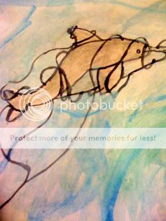
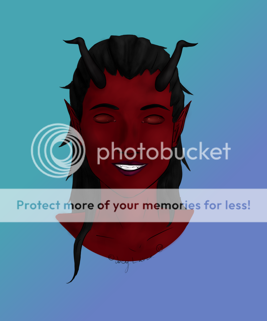
- Title: L (Without A Lolli T-T) Better
- Artist: Gods Receptionist
- Description: It's another version of the other pic. I erased the lolli. It looks better without it. He's slumping a little. In case you couldn't tell, this is L. I own no rights to it (duh) byt it's a cute little piece of fanartz. 5 me plz
- Date: 01/31/2009
- Tags: without lolli better death note
- Report Post
Comments (7 Comments)

- kick butt avian - 05/12/2011
-
Hoo-Hum:::
What the heck are you talking about!? Its KAWAII!!! And it dosent have to look EXACTLY like him... Its Fan Art! Only the artists who came up with the character "L" would be ablt to draw it perfectly! And I agree with Vanirra Bean, It is a chibi, so its supposed to be a little deformed... I think its adoreable! But people have their opinions... But Mine are better then yours >_> 23/5 - Report As Spam

- Silly Rabbbit - 07/12/2009
- It's adorable. :*
- Report As Spam

- snowymizu - 05/02/2009
- he's a little over-weight...but is still L!! is a 5/5 in meh opinion...
- Report As Spam

- xX_kismh_Xx - 03/29/2009
- i go with fenikkusu, hoo-hum ur a jerk, and ur drawing looks awesome, dont take wat other ppl tell u, it makes u feel bad and ofeended, this is really good, compared to my drawings, i cannot draw chibis so if this scale went to 1000 i would go for a million 100000000000/5 ^_^ good job
- Report As Spam

- espirando - 02/16/2009
- by the way, you spelled "write" incorrectly. i fail to see how it is deformed, i mean, its a chibi. it does look like him, and it's most likely better than you could do. so dont be a.... a jerk.
- Report As Spam
- espirando - 02/16/2009
-
To Hoo-Hum:
YOUR MOTHER. - Report As Spam

- Hoo-Hum - 02/16/2009
-
First Of All, Thats NOT How You Wright "L".
Second Of All, The Pose You Put "L" In Is Not Correct, Its Deformed And Is NOT The Way "L" Would Stand Or Sit.
Third Of All, The Drawing Does Not Look Like Him.
Forth Of All, Your Drawing Isnt Good.
ADVICE: Take Drawing Lessons
1/5 - Report As Spam